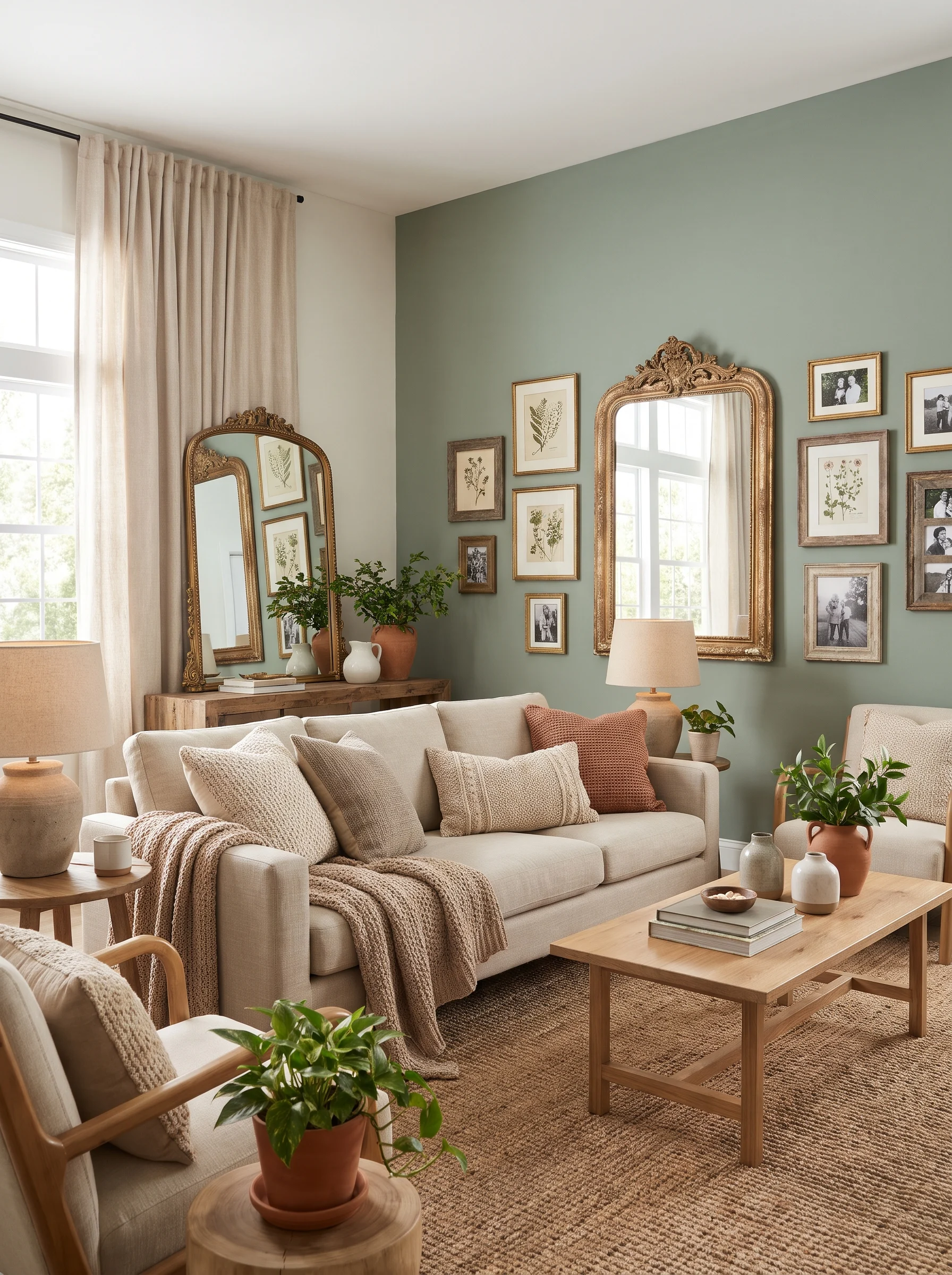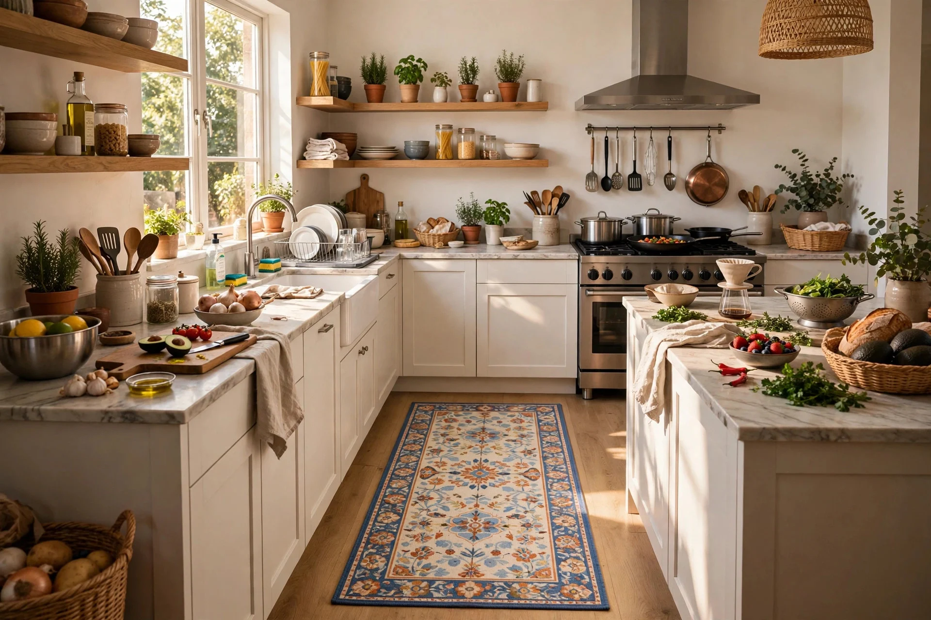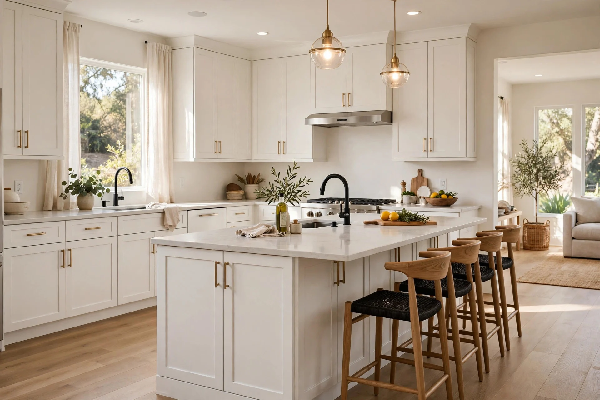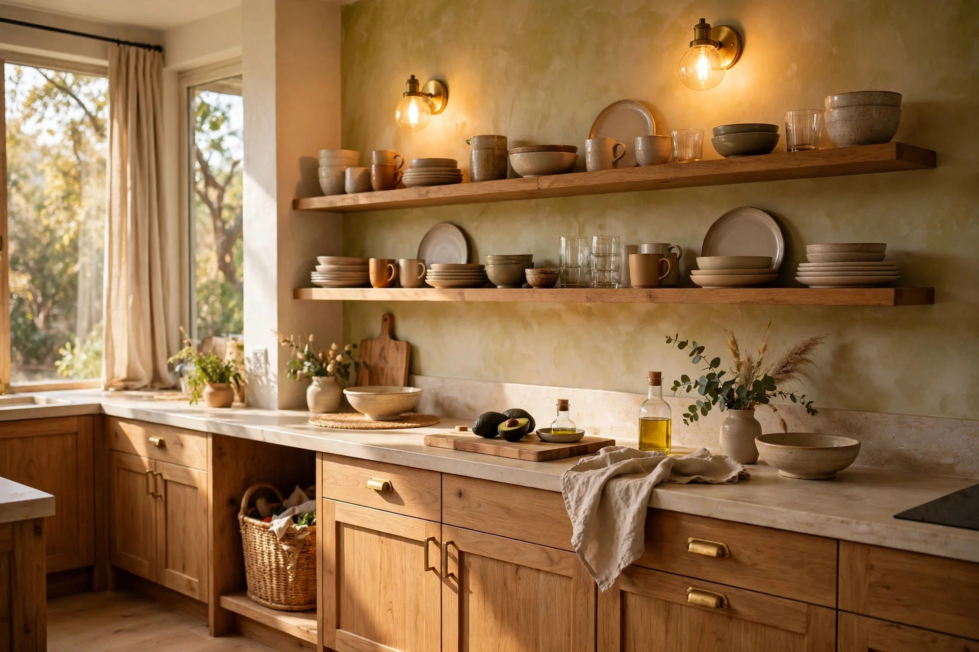
Paint chips have a way of lying. That perfect soft green looks calm on a two-inch card, then turns minty on forty cabinet doors under your kitchen lights. Meanwhile the “safe” white you picked leans yellow next to the countertop. By the third sample pot, most people are standing in the kitchen at 9 p.m., holding swatches against the fridge and wondering if any color is really right.
Cabinet color is a bigger decision than wall color for a simple reason: cabinets fill more of the room than anything else, they’re harder to repaint, and they set the tone for every other choice, from countertops to hardware to the mood at dinner. Get them right and the kitchen feels settled. Get them wrong and you notice it every day.
Here’s the encouraging bit. Some colors work in almost any home, because they respond well to different light, different floors, and different budgets. The trick is knowing what each one needs from the room around it: the right undertone, the right finish, the right partner on the counters.
Below are 13 cabinet colors with the details that matter, including where each one shines, what to pair it with, and the mistakes people make once the brush is in hand. After those come a comparison table, a buying guide, and answers to common questions.
1. Warm White
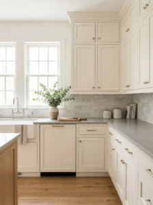
A warm white is the closest thing to a universal answer, and the reason is practical. It reflects light, makes small kitchens feel larger, and sits comfortably beside nearly every countertop and floor. It’s also forgiving of the other colors you add later.
Look for whites with a slight cream or ivory base, not stark, bluish ones. Stark white can feel clinical beside wood floors, while a softer white reads as welcoming. In north-facing rooms, warm whites stop the space from looking chilly.
Pair it with natural stone, butcher block, or soft gray quartz, and choose brass, nickel, or black hardware depending on the mood. A satin or semi-gloss finish wipes clean easily.
The mistake to avoid is picking from a small chip. Brush a large sample on a board and move it around the room through the day. Whites shift more than any other color, sometimes pinkish in the evening, sometimes gray at noon.
In daily life, white cabinets make a kitchen feel tidy even when it isn’t, since light bounces into corners that would otherwise sit in shadow.
2. Soft Greige
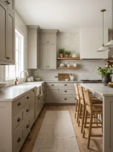
Greige splits the difference between gray and beige, and that’s why it holds up in so many houses. It avoids the coldness of pure gray and the sleepiness of beige, which makes it flexible with changing trends.
It works best in open-plan homes where the kitchen sits beside living areas painted in similar neutrals. Choose one with a mid-light value, roughly the shade of oatmeal or pale stone, so it stays bright without looking washed out. Greige loves natural materials: oak stools, linen curtains, honed marble, or leathered granite.
Undertones decide everything. A greige with green or yellow notes can turn muddy beside cool-toned tile, while one with a pinkish base can fight red-toned floors. Hold a sample against the flooring and the countertop together.
Choose a matte or satin finish, since gloss on a mid-tone color shows every fingerprint. Black or aged brass pulls give it a little edge.
What people notice after a few months is how little it demands. It hides splashes and scuffs better than white, and it doesn’t date quickly.
3. Sage Green
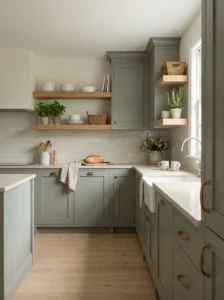
Sage has stayed popular because it feels natural rather than trendy. It’s a gray-green with enough softness to act almost like a neutral, and it connects a kitchen to the garden outside.
It suits farmhouse, cottage, and transitional homes, particularly where there’s wood or stone. Pair it with creamy countertops, brass hardware, and open shelves holding white dishes. In a modern kitchen, matte black fixtures and a plain quartz counter give it a crisper look.
Light changes its mood. In bright rooms it reads fresh and airy, while in dim ones it can look gray. If your kitchen has limited daylight, choose a sage with a touch more yellow in it, which stays warm.
Avoid pairing it with strong orange-toned wood floors, which can make the green look dull. Medium and pale oak, or gray-washed floors, suit it far better.
A small experiment is worth doing: paint the lower cabinets only and keep the uppers white. It’s a gentle way to try the color before committing to all of it, and many people find they love how restful it feels while cooking.
4. Navy Blue
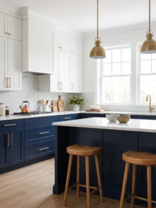
Navy brings weight and polish without the heaviness of black. It’s one of the few dark colors that reads as classic, and it makes white countertops and brass hardware look expensive.
It suits kitchens with plenty of natural light or good artificial lighting, especially for islands and lower cabinets. In a smaller room, use it on the base cabinets and keep the uppers light so the space doesn’t close in. Pair it with white marble-look counters, warm wood stools, and gold or brushed brass pulls.
Choose a navy with a hint of gray rather than a pure saturated blue. The grayer versions look sophisticated, while very bright navy can feel like office furniture. Satin finishes show wear less than gloss.
Test the color at night. Under warm bulbs, navy sometimes turns nearly black, and that can be lovely or oppressive depending on the room.
The practical upside is that dark blue hides the daily mess. Splatters, smudges, and scuffs vanish into the color, which suits busy households with kids or pets.
5. Charcoal Gray
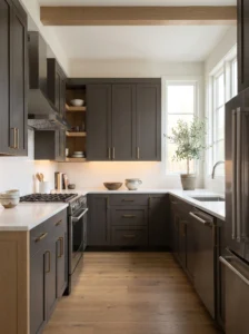
Charcoal is the confident cousin of gray, and it suits modern kitchens that want depth without going fully black. It anchors an open plan and gives light countertops something to push against.
It works well in homes with big windows, white walls, and pale floors, where its darkness reads as contrast and not gloom. Combine it with white quartz, stainless steel appliances, and light wood accents. A touch of brass or copper stops the palette from feeling cold.
Choose a charcoal with a slight warm or blue undertone, depending on your other finishes. A flat charcoal can look lifeless, while one with a subtle undertone feels layered.
Use matte or satin finishes, since gloss in dark colors magnifies every mark. Plan on good under-cabinet lighting so the color doesn’t swallow the work surface.
A mistake worth avoiding is using charcoal on every cabinet in a small, windowless kitchen. The room will feel smaller. Splitting it between island and perimeter, or between bases and uppers, keeps balance.
People who live with it often say it makes the kitchen feel grounded and calm, a place where things look deliberate.
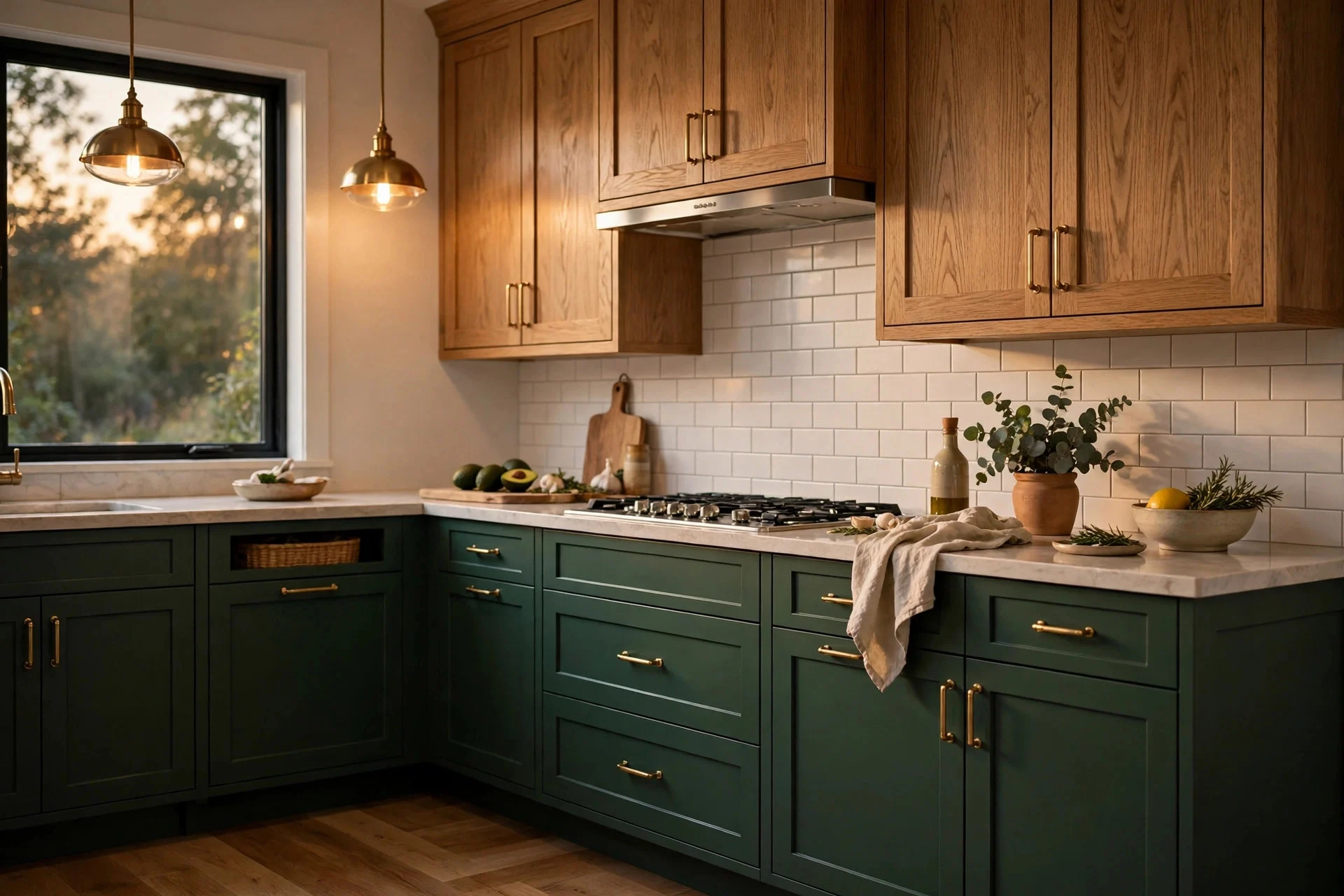
6. Deep Forest Green
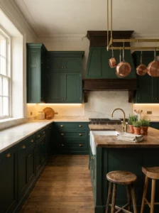
A deep green has the richness of a library and the freshness of a garden, which is an unusual combination. It suits kitchens that want personality without shouting.
It looks especially good in older homes, traditional layouts, and rooms with warm wood. Pair it with creamy marble, brass fixtures, and linen or natural-fiber textiles. In a modern space, it works with matte black hardware and light concrete-look counters.
Pick a green with enough depth to read as a neutral, something like pine or hunter, and avoid versions that lean too blue or too yellow. Sample it in morning and evening light, because green shifts more than most colors.
Lighting is the key. Add warm under-cabinet lights and a couple of good pendants, so the color glows rather than sinks. Keep the walls light.
Avoid combining it with too many other strong colors. One deep shade on the cabinets, plus neutral walls and wood, is plenty.
After a few weeks, you’ll probably notice how well it flatters plants, fruit bowls, and copper pans. The kitchen starts to feel curated just from what you leave on the counter.
7. Dove Gray
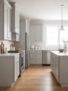
Dove gray is lighter and softer than charcoal, and it earns its place by being quietly adaptable. It gives a calm, clean look without the starkness of white, and it hides dust and fingerprints far better.
It suits contemporary and transitional kitchens, as well as homes where cooler finishes already dominate. Pair it with white or soft gray quartz, stainless appliances, and chrome or brushed nickel hardware. A warm wood floor or a few wooden accessories stop the room from feeling icy.
Choose a gray with a slight warm undertone if your light is cool, and a neutral one if your room is sunny. Gray can look blue in north light, so check it carefully.
Use a satin finish for easy cleaning. A glossy look can feel too sleek, especially in a smaller room.
The classic mistake is buying gray from a photo. Screens exaggerate or flatten gray more than any other color. Bring home a physical sample and hold it beside your countertop.
In day-to-day living, dove gray is easy to coordinate. New appliances, stools, and rugs tend to sit comfortably beside it, which makes future updates less stressful.
8. Cream and Butter
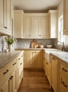
Cream is warmer and gentler than white, and it carries a traditional, welcoming quality. Butter-toned variants add a touch more sunshine without becoming yellow.
It suits country kitchens, older homes, and spaces with natural wood. Pair it with granite or soapstone, oil-rubbed bronze or antique brass hardware, and patterned tile backsplashes. It also works with painted brick or beadboard.
Choose a cream with a creamy, slightly beige base. Avoid versions that lean too yellow, because they can look dated beside modern appliances. In a sunny kitchen, a cooler cream balances the warmth of daylight.
Apply a satin or semi-gloss finish, since cream shows grease and fingerprints near the stove more than some colors. A light glaze or subtle distressing can add depth for a traditional look.
One thing worth doing is comparing it directly with the backsplash. Cream can look yellowish next to bright white tile, and pale subway tile in an off-white shade usually looks better.
For daily life, cream feels friendly. It makes a kitchen look lived-in and generous, and it flatters natural light in the early morning.
9. Two-Tone White and Wood
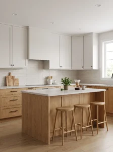
Not every cabinet color has to be paint. Combining white or cream cabinets with natural wood on an island, lowers, or open shelving brings warmth and variety, and it works in almost any style.
It suits modern, Scandinavian, and farmhouse kitchens alike. Keep the main run in a soft white and use oak, walnut, or ash for the contrast. Tie the wood tone to a few other elements, such as stools, a cutting board, or a floating shelf, so it looks planned.
Choose wood with a clear or light finish, because dark stains can feel heavy beside bright white. Match the grain direction across doors for a tidy look. Hardware in black or brass pairs easily with either tone.
The mistake is using too many different woods. Stick with one species, and let the rest of the room stay quiet.
Because wood ages gracefully, this combination tends to look better with time. Small scratches and soft patina on a wooden island give the kitchen character, while white keeps everything bright.
It’s a smart choice for people torn between warm and clean, since it gives both.
10. Muted Blue-Gray
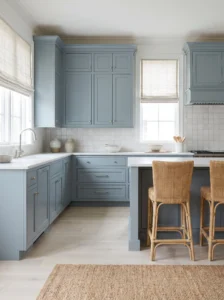
Blue-gray sits between gray and blue, and it feels soft, coastal, and a little vintage. It brings color without the commitment of navy, which makes it a popular pick for kitchens that need a gentle lift.
It suits cottages, beach houses, and traditional homes with white trim. Pair it with white countertops, polished nickel hardware, and light wood floors. Woven stools and linen window treatments reinforce the relaxed mood.
Pick a version with enough gray that it doesn’t read as baby blue. Hold it against the countertop sample, because some blue-grays look purple beside certain stones. Matte or satin finishes keep it looking soft.
North-facing kitchens can make this color look cold, so choose a warmer blue-gray if daylight is limited. In sunny rooms, a cooler tone stays crisp.
A frequent mistake is combining it with strong yellow undertones in the floors or walls, which can make the blue look dull. Keep surrounding colors neutral and clean.
Many people find it quietly cheering. On a gray morning, a blue-gray kitchen feels lighter than white, and in summer it gives the sense of cool water without any fuss.
11. Black
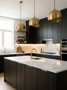
Black cabinets once seemed risky, but in the right kitchen they look sharp, sophisticated, and surprisingly timeless. The color makes everything around it stand out, from stone counters to brass fixtures.
It suits modern, industrial, and dramatic traditional kitchens, particularly those with large windows or high ceilings. Pair it with white or light-toned counters, warm wood accents, and gold or matte black hardware. Keep walls light, so the cabinets become the anchor.
Choose a soft black with a hint of warmth rather than a flat, inky shade. Matte or satin finishes minimize fingerprints and look refined. Add layered lighting: under-cabinet strips, pendants, and a bright overhead source.
Dust and water spots show on black, so plan on wiping the surfaces regularly. Choose hardware with a different finish, since black pulls vanish against black doors.
Avoid using it everywhere in a tiny or dim kitchen. Partial use, such as on the island or lower cabinets, keeps the room balanced.
Owners often say black makes the space feel intentional, as though every other item has been chosen to sit against it.
12. Terracotta and Clay
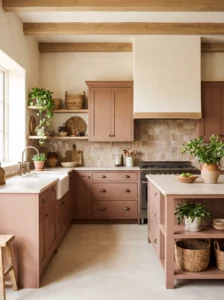
Earthy clay tones bring warmth that most whites and grays can’t match. They suit kitchens that want a sun-baked, Mediterranean, or desert-inspired atmosphere, and they feel fresh against the sea of neutral kitchens.
Pick a muted version, softer than bright orange, with a hint of brown or pink. It pairs well with cream walls, natural wood, woven textures, and brass or aged bronze fixtures. Plaster-look walls or handmade tile add to the mood.
Use it where it makes sense. A full run of terracotta cabinets can be bold, so some people limit it to an island, a bar area, or lower cabinets. Matte finishes look the most natural.
Check how it looks next to your flooring. Orange-toned wood floors can compete, while pale oak or stone floors balance it well.
Avoid pairing it with cool, blue-based whites, which can make the clay look dusty. Choose warm creams instead.
In practice, this color is a mood-lifter. A kitchen in clay tones feels warm even on cold mornings, and it flatters food, plants, and pottery in a way that cooler colors rarely do.
13. Soft Taupe
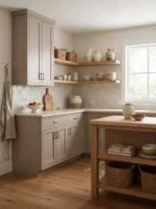
Taupe is a gentle brown-gray that feels grounded and dependable. It’s less obvious than white and less stark than gray, and it suits homes that want a quiet, layered look.
It works in traditional, transitional, and modern spaces, particularly where earthy materials such as stone, wood, and linen are already present. Pair it with white or cream countertops, brushed brass hardware, and a mix of matte and textured finishes.
Choose a taupe with balanced undertones. Too pink looks dated, too green looks drab. A mid-value shade holds its character in different light, and a satin finish keeps it wipeable.
Because it’s so neutral, taupe benefits from texture. Open shelving, woven baskets, and a tile with subtle variation give it depth. Without those touches, an all-taupe room can feel flat.
A mistake is matching the wall color to the cabinets too closely, so the kitchen becomes one blur. Aim for a clear step in value between walls and cabinets.
For long-term living, taupe is a safe, gentle choice. It tolerates changes in decor and ages with the house, which means fewer repainting decisions down the line.
Quick Comparison: Which Cabinet Color Suits Your Kitchen?
| Type | Best Use | Material | Style/Vibe | Difficulty Level |
|---|---|---|---|---|
| Warm white | Small or dim kitchens | Painted wood or MDF | Clean, classic | Easy |
| Soft greige | Open-plan homes | Painted wood, matte or satin | Calm, neutral | Easy |
| Sage green | Cottage and farmhouse kitchens | Painted wood with natural accents | Soft, organic | Moderate |
| Navy blue | Islands and lower cabinets | Painted or lacquered finish | Polished, traditional | Moderate |
| Black | Modern or dramatic kitchens | Matte painted or laminate | Bold, graphic | Advanced |
| Two-tone white and wood | Mixed styles, warm and bright | Painted cabinets with oak or walnut | Balanced, modern | Moderate |
How to Choose the Right Cabinet Color
Start with light. Note which direction your kitchen faces, how many windows there are, and what bulbs you use. North-facing rooms tend to cool colors, so warmer tones help, while south-facing rooms can handle cooler shades and deeper hues without turning dull.
Look at what’s staying. Floors, countertops, backsplash, and appliances are the fixed points, and the cabinet color should work with their undertones. Bring samples of each to the paint store, and compare them in daylight and under evening bulbs.
Size matters. In small kitchens, lighter tones expand the room, while dark colors work best when restricted to part of the cabinetry. In large kitchens, darker colors add depth and keep the space from looking vast and empty.
Material and finish affect both look and durability. Solid wood and quality MDF take paint well, while thermofoil and laminate can peel if overheated near the stove. Satin and semi-gloss finishes clean easily, and matte looks softer but may need more care. Professional spray finishes last longer than brushed-on paint, though they cost more.
Budget carefully. Painting existing cabinets is the lowest-cost route, replacing doors costs more, and new cabinetry is the most expensive. Prep work, including cleaning, sanding, and priming, accounts for much of a good result, so don’t skimp on it.
Common regrets include choosing from a small chip, ignoring undertones, picking a trendy color that clashes with fixed finishes, and using low-quality paint. Test a large sample on a door or board, live with it for several days, and ask a paint supplier for a cabinet-specific product.
Settling on a Color
The best cabinet color is rarely the loudest or the most fashionable. It’s the one that suits your light, your fixed finishes, and the way you actually use the room. Warm whites, greige, and taupe give flexibility. Sage, navy, and forest green bring character while staying classic. Black, terracotta, and charcoal reward people who want a stronger statement.
If you’re nervous, start with a half measure: paint just the island, or choose one color for the lowers and another for the uppers. You’ll learn quickly how the color behaves in your light, and you can expand later if you love it.
Take your time with samples. Paint large boards, tape them up near the windows, and look at them at different times over a few days. Check them next to your counters, floors, and hardware. Ask a neighbor or friend to give an honest opinion too, since fresh eyes spot an off undertone fast.
Once the decision is made, invest in careful prep and good paint. A well-applied finish in a sensible color will outlast a trend. When you walk in on a regular weekday morning and the kitchen simply feels right, that’s your sign the color works.
FAQs
What is the most popular kitchen cabinet color?
White in its various warm tones remains the most common choice, followed closely by soft gray, greige, and green. Popularity changes, so choose a color that suits your light and finishes rather than following a list.
Do dark cabinets make a kitchen look smaller?
They can in small or dim rooms. In kitchens with good daylight and light counters, dark cabinets add depth and look elegant. Using dark color on the island or lower cabinets only is a safe way to try them.
How much does it cost to paint kitchen cabinets?
Costs vary with the size of the kitchen, the condition of the cabinets, and whether you hire a pro. DIY painting is the cheapest, while professional spraying costs more but lasts longer. Get a few quotes to compare.
What finish is best for kitchen cabinets?
Satin and semi-gloss are popular because they clean easily and resist moisture. Matte has a softer look but can mark more easily. Choose a durable cabinet-grade paint for either.
How do I choose between warm and cool colors?
Look at your lighting and fixed finishes. Warm colors suit north-facing or dim rooms, while cool colors work in bright, sunny ones. Sample both against your countertops and floors.
Should cabinet color match the walls?
Not necessarily. Some contrast helps define the cabinets, though a close match in a similar value can look calm and seamless. Avoid a perfect match, which can feel flat.
How long does painted cabinet finish last?
With proper prep, primer, and quality paint, a finish can last many years. Professional spray finishes tend to last longer than brushed ones. Regular gentle cleaning helps preserve the surface.
Can I mix two cabinet colors in one kitchen?
Yes. Two-tone designs, such as a darker island with lighter perimeter cabinets, are popular and add depth. Keep the palette limited and tie the colors together with hardware and accessories.