Most people rearrange their bedroom furniture the same way they inherited it — bed against the biggest wall, dressers wherever they fit, and a nightstand crammed into whatever gap is left. Nobody ever taught us that a room’s layout affects how well we sleep, how calm we feel walking in after a long day, or how easy it is to actually relax instead of just lying there scrolling through your phone.
A master bedroom isn’t just a place to sleep. It’s the one room in the house that’s supposed to be entirely yours, and yet it’s often the most neglected in terms of planning. Living rooms get styled for guests. Kitchens get renovated for resale value. Bedrooms get whatever’s left over — literally and figuratively.
The good news is that fixing this doesn’t require a renovation budget. Layout changes are some of the cheapest, highest-impact adjustments you can make to a bedroom, and they work regardless of square footage. A small room arranged with intention can feel more spacious than a large one arranged carelessly.
This list walks through layout ideas suited to different room shapes, sizes, and lifestyles — from compact starter-home bedrooms to sprawling primary suites with sitting areas. Some ideas focus on bed placement and flow, others on storage integration, and a few on creating distinct zones within one room. Pick the ones that match your space and your habits, and don’t feel obligated to use all of them at once. A good bedroom layout is built from two or three smart decisions, not twenty.
1. Center the Bed on the Longest Wall
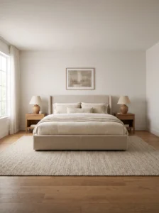
This is the layout most designers default to, and for good reason — it creates immediate visual balance and gives you symmetrical space on either side for nightstands. It works because the eye naturally settles when a large object sits centered against the largest surface in the room, which makes the whole space feel intentional rather than accidental.
This approach works best in rectangular bedrooms where the longest wall doesn’t have a window running through the middle of it. If your longest wall is broken up by a window, this layout will fight the room’s natural proportions instead of working with them.
For sizing, leave at least 24 inches of clearance on each side of the bed for walking space, and closer to 36 inches if you want room for a chair or bench at the foot. Stick to matching nightstands and lamps to reinforce the symmetry — mismatched pieces undercut the calm effect you’re going for. Warm, dimmable lighting on both sides prevents one side of the bed from feeling like an afterthought.
The mistake people make here is pushing the bed too far into the corner to “save space,” which throws off the symmetry and makes the room feel cramped rather than efficient. Centered doesn’t mean centered against one corner — measure the wall and split the difference evenly.
2. Angle the Bed Into a Corner
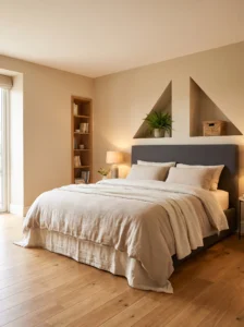
Placing the bed diagonally across a corner is an unconventional move, but in oddly shaped or awkward rooms, it can solve problems a straight layout can’t. It breaks up boxiness and gives you two triangular pockets of space behind the headboard that are otherwise wasted.
This works particularly well in rooms with an unusual footprint — an L-shape, an alcove, or a room where the door and closet placement make a straight-wall layout awkward. It also suits people who like a slightly softer, less rigid feel to their space.
Angle the bed at roughly 45 degrees, and make sure there’s enough floor space behind the headboard to justify the choice — otherwise you’re just creating a dead zone. Use the triangular gaps behind the bed for a narrow bookshelf, a plant, or additional storage. Keep the color palette simple here since the diagonal line already adds visual movement; too many patterns on top of that will feel busy.
One thing worth knowing before committing: this layout eats more floor space than a wall-anchored bed, so it only makes sense in rooms with enough square footage to spare. In a tight room, it can make the space feel smaller rather than more interesting.
3. Float the Bed With a Console Behind It
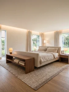
A floating bed layout — where the headboard sits away from the wall with a console table, bench, or narrow shelf behind it — works beautifully in larger bedrooms that would otherwise feel like they have too much empty floor in the middle.
This layout shines in rooms over 200 square feet where a wall-anchored bed leaves an awkward, unused stretch of floor. It also works well when the room’s only logical “headboard wall” is directly across from the door, since floating the bed slightly forward softens that head-on view.
Leave 12 to 18 inches between the headboard and the console piece behind it, enough to tuck the bed skirt in but not so much that the gap becomes a dust trap. A low bench or console around 30 inches tall keeps sightlines open across the room. Use this backside space for folded throws, a small lamp, or framed art leaning against the wall instead of hung — it reads more relaxed.
The furniture behind the bed needs to be lower than the headboard, or the whole arrangement starts to look top-heavy. This is one of those layouts that photographs beautifully but genuinely does improve how a large room feels to walk through, since it breaks up what would otherwise be one long, undefined stretch of carpet.
4. Use a Herringbone or Diagonal Rug to Anchor an Awkward Layout
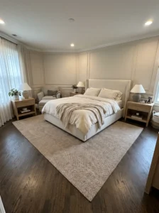
Sometimes the layout problem isn’t the furniture — it’s that the room itself doesn’t offer a clean rectangle to work with. In these cases, a diagonally laid or herringbone-patterned rug can visually reset the room’s geometry without moving a single piece of furniture.
This trick works best in rooms with a slanted ceiling, an off-center door, or a window placement that makes a symmetrical furniture layout impossible. Rather than fighting the room’s quirks, the rug gives your eye a new anchor point to follow.
Choose a rug large enough that the bed and at least one nightstand sit on it — a rug that only peeks out from under the bed frame reads as an afterthought rather than a design choice. Warm neutral tones or a subtle geometric pattern work best since the diagonal placement already introduces enough visual interest on its own. Wool or a wool-blend holds its shape well under furniture legs, which matters if the bed will sit partially on top of it.
The mistake to avoid is choosing a rug so busy that it competes with an already irregular room shape — you want it to calm the space down, not add another layer of visual noise on top of an already asymmetrical layout.
5. Create a Reading Nook in an Unused Corner
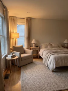
If your bedroom has a corner that’s currently collecting laundry baskets or empty suitcases, that’s prime real estate for a small reading chair and floor lamp. This layout works because it gives the room a second purpose beyond sleeping, which matters more than people expect — a bedroom that’s only for sleep can start to feel purely functional rather than restful.
This idea works best in bedrooms with at least one corner that isn’t already claimed by the closet, door swing, or window. It’s especially valuable in homes without a separate den or office, where the bedroom needs to double as a quiet retreat.
A single armchair, a small side table, and a floor lamp are really all you need — resist the urge to add a whole seating group unless the room is unusually large. Keep the chair angled toward the window if there is one, and choose a lamp with a warm bulb rather than daylight-toned LEDs, since this corner is meant for winding down, not working.
The most common mistake is treating this nook as a catch-all for stray furniture instead of curating it the way you would any other seating area. A reading corner that’s actually used tends to become the most personal spot in the whole house.
6. Split the Room Into Sleep and Dressing Zones
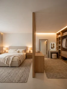
In larger primary suites, dividing the room into a sleeping zone and a separate dressing or vanity zone keeps the getting-ready chaos from spilling into the calm part of the room. This works because it mimics how boutique hotels are laid out — the bed area stays serene while the practical, cluttered parts of your morning routine happen somewhere else in the same room.
This layout needs square footage to work, generally 250 square feet or more, and benefits from a room shape that naturally offers two distinct areas, like an L-shape or a room with a bump-out.
Use a rug or a change in furniture height to signal the transition between zones rather than a hard wall — a low dresser or open shelving unit can serve as a soft divider. Keep the color palette consistent between both zones so the room still reads as one cohesive space rather than two competing ones. Task lighting belongs in the dressing zone; ambient, dimmable lighting belongs by the bed.
The habit this layout supports is subtle but real — you stop making your bed area look like a closet exploded in it, because the closet-adjacent mess has somewhere else to live.
7. Position the Bed to Face the Door Directly
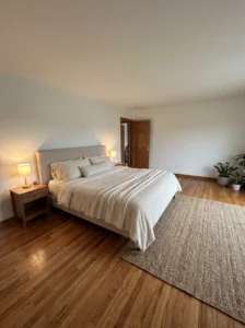
There’s a practical and slightly psychological reason many people prefer sightlines to the door from bed — it removes the low-grade unease of not being able to see who’s entering a room. This layout isn’t about feng shui rules specifically, but the underlying logic of it holds up: a clear view of the entry tends to feel more restful than a bed tucked where the door swings in behind you unseen.
This works in almost any rectangular room where the door isn’t directly beside the headboard wall. It’s particularly worth prioritizing in shared bedrooms or homes with kids and pets who tend to burst in unannounced.
Aim to place the bed diagonally across from the door rather than in direct line with it — directly facing the door can feel exposed, while an angled view still lets you see who’s coming in without the bed feeling like it’s on display. Keep the foot of the bed clear of furniture that would block that sightline, like a large bench or blanket chest.
People often don’t notice this discomfort until it’s fixed — plenty of clients only realize how much better they sleep once the bed stops facing a blank wall with the door somewhere behind them.
8. Use Bookshelves as a Room Divider for Open-Plan Bedrooms
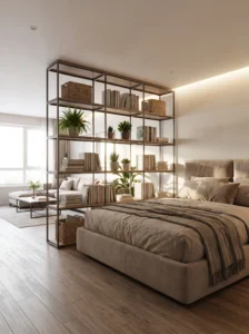
Loft-style bedrooms and studio apartments often don’t have a dedicated bedroom at all, just an open area that needs to double as one. A tall, open-backed bookshelf placed perpendicular to the bed can define a sleeping area without closing off light or airflow the way a solid wall or curtain would.
This solution is built for open-concept living spaces, converted lofts, or studio apartments where a full partition isn’t allowed or wouldn’t make sense.
Choose a shelving unit at least 5 feet tall so it reads as a real divider rather than a low console, and keep it open-backed so light still passes through from the other side of the room. Style it with a mix of books, boxes, and a few plants rather than packing every shelf solid, which would defeat the airy purpose of choosing open shelving in the first place.
The upside people don’t expect is how much a defined “bedroom edge” changes the psychological experience of the space — even without a door, having a visual boundary makes the sleeping area feel genuinely separate from the living area, which helps you switch off at night.
9. Anchor a Small Room With a Platform Bed and Built-In Nightstands
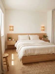
Tiny bedrooms — think under 100 square feet — don’t have room for a bed frame, two nightstands, and a dresser without feeling like an obstacle course. A platform bed with built-in nightstands solves this by consolidating three pieces of furniture into one footprint.
This layout is made for small primary bedrooms, guest rooms doing double duty, or apartments where every square foot is precious.
Look for platforms where the nightstand surface is integrated into the bed frame itself rather than floating separately, since this removes the gap where dust and clutter usually collect. Light wood tones or a matte white finish keep the piece from visually dominating a small room the way a dark, bulky frame would. Wall-mounted sconces above the built-in nightstands free up the surface entirely for a lamp-free, clutter-resistant setup.
The mistake to avoid is assuming built-in storage means you can skip planning altogether — even integrated furniture needs breathing room around it, so measure your walking clearance before ordering anything custom.
10. Add a Bench at the Foot of the Bed
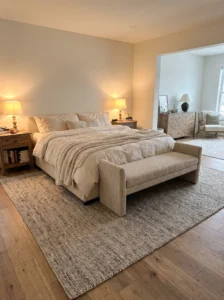
A bench at the foot of the bed is one of the simplest layout upgrades that instantly makes a room feel more finished, and it’s functional in a way that’s easy to underestimate — it’s where clothes actually land instead of the floor or the chair in the corner.
This works in almost any bedroom with at least 24 inches of clearance beyond the foot of the bed, which most rooms have if the bed isn’t already pushed against the opposite wall.
Size the bench to roughly two-thirds the width of the bed frame rather than matching it exactly, which looks more intentional. Upholstered benches in a durable weave hold up better over time than delicate fabrics, especially if pets are involved. Keep the bench lower than the mattress height so it doesn’t visually compete with the headboard.
What people notice after adding one isn’t dramatic — it’s just that clothes stop piling up on the floor, because there’s finally a designated spot for the “not dirty, not clean enough to fold away” pile everyone actually has.
11. Use a Canopy or Curtain Track to Define the Bed Zone Without Walls
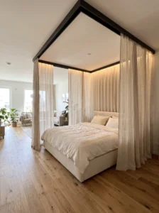
In studio apartments or open-plan primary suites, a ceiling-mounted curtain track around the bed creates privacy and a sense of enclosure without any construction. It works because enclosed sleeping spaces tend to feel more secure and restful than beds that are fully exposed on every side.
This idea suits open floor plans, shared living situations, or anyone renting who can’t put up permanent walls but still wants a bedroom that feels like its own space.
Mount the track directly to the ceiling in a rectangle slightly larger than the bed footprint, and choose a lightweight linen or cotton curtain that can be pulled fully open during the day. Stick to a single neutral tone rather than a patterned fabric, since the curtains already add enough softness and texture on their own. Battery-powered puck lights inside the enclosure solve the lighting problem without needing an electrician.
The trade-off worth knowing is that heavy curtains can trap heat in a small enclosure, so this works best with breathable fabric and a fan or good airflow nearby.
12. Pair a Storage Bed With Minimal Surrounding Furniture
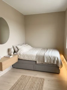
A bed frame with built-in drawer storage underneath can replace an entire dresser in bedrooms where floor space matters more than surface space. This layout works because it hides bulk storage below eye level, which keeps a small room feeling visually open even when it’s holding just as much stuff as a room with a full dresser.
This is worth considering in bedrooms under 130 square feet, or in any room where a dresser would block a window, door swing, or closet access.
Choose a storage bed with drawers on the sides rather than a lift-up base if you need daily access to clothes, since lift-up frames require moving the mattress to get inside. Keep the rest of the room’s furniture minimal — a single nightstand and a slim wall mirror are usually enough once the bed is doing the heavy lifting on storage.
The trade-off is that storage beds are heavier and harder to move than standard frames, so this is more of a “set it and leave it” layout than one you’ll want to rearrange every year.
13. Layer Two Rugs for a Boutique Hotel Feel
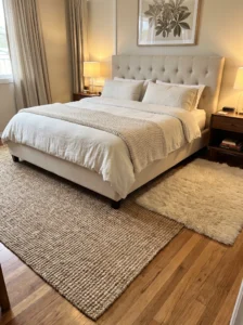
Using a large jute or sisal rug as a base layer with a smaller, softer rug on top near the bed is a trick borrowed from boutique hotels, and it solves a real problem — most bedroom rugs are either too small to matter or too expensive to size up to cover the whole floor.
This works in any bedroom where the budget doesn’t stretch to one oversized rug, which, realistically, is most bedrooms.
Size the base rug to extend at least 18 inches past the sides of the bed, and layer a smaller, textured rug on top positioned where your feet actually land when you get out of bed. Stick to a neutral, textured base layer and let the top rug carry color or pattern, since two bold rugs stacked together usually look chaotic rather than curated.
The comfort upgrade is more noticeable than the visual one, honestly — a soft rug exactly where your feet hit the floor each morning changes the whole feel of waking up, especially over hardwood or tile.
14. Mount Wall Sconces Instead of Table Lamps
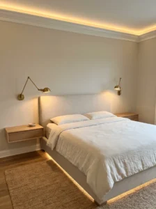
Swapping table lamps for wall-mounted sconces frees up nightstand surface space and solves the cord-clutter problem that plagues most bedside setups. It’s a small change, but it has an outsized effect on how tidy the whole room feels.
This works particularly well with narrow nightstands or floating shelves that don’t have room for a lamp base, and in bedrooms where cord management has become a genuine visual annoyance.
Mount sconces roughly 24 to 28 inches above the nightstand surface, angled so the light falls across the bed rather than straight down. Choose swing-arm or adjustable-head sconces if you read in bed, since fixed downlighting doesn’t always land where you need it. Hardwiring is ideal, but plug-in sconces with a cord cover channel are a solid workaround in a rental.
The mistake worth flagging is mounting them too high out of habit — most sconces look better lower than people expect, closer to head height when seated up against the headboard.
15. Use a Daybed as a Secondary Seating Option
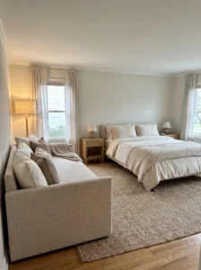
In primary bedrooms with enough square footage, a daybed positioned along a side wall gives you flexible seating that doubles as an occasional guest bed, without committing an entire zone to a formal sitting area.
This layout fits well in bedrooms over 180 square feet with a wall that isn’t otherwise being used for storage or a dresser.
Position the daybed perpendicular to the main bed rather than parallel, which keeps sightlines open and avoids the room feeling like it has two beds competing for attention. A daybed with a trundle underneath adds guest-sleeping flexibility without a second layout change. Keep the daybed’s upholstery in a different but complementary tone to the primary bed, so the two don’t blur into one oversized furniture block.
The unexpected benefit shows up on lazy weekend mornings — having a second, distinct spot to sit with coffee changes the room from purely a bed you get in and out of into a space you actually want to spend time in.
16. Keep the Layout Symmetrical but Break It With One Asymmetrical Piece
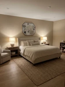
A fully symmetrical bedroom — matching nightstands, matching lamps, centered bed — can start to feel a little sterile if nothing interrupts the pattern. Introducing one deliberately asymmetrical element, like a single oversized piece of art off to one side or a floor lamp instead of a matching second nightstand lamp, keeps the room from feeling like a hotel catalog page.
This works best once the rest of the room is already fairly balanced — it’s a finishing move, not a starting point, and it needs a calm backdrop to read as intentional rather than unfinished.
Pick one spot for the asymmetrical element and commit to it fully rather than scattering small mismatched details throughout the room, which just reads as inconsistent. A single large framed print, hung slightly off-center from the bed, is usually enough. Keep everything else in the room strictly matched so the one break in the pattern actually stands out.
The room ends up feeling more like a place someone actually lives in, rather than a showroom display — which, for a bedroom in particular, tends to matter more than perfect symmetry.
17. Push the Bed Against the Shortest Wall in a Narrow Room
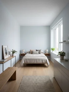
Long, narrow bedrooms trip people up because the instinct is always to place the bed lengthwise along the longer wall, which usually leaves almost no walking room on either side. Flipping that logic and placing the bed against the shorter end wall often solves the whole problem at once.
This works in galley-style bedrooms, converted dens, or older homes with narrow room proportions where a standard layout just doesn’t fit.
Measure the short wall carefully before ordering a frame, since a queen or king might genuinely be too wide for it — a full or a slim platform queen often fits better in these spaces. Keep furniture along the long walls low profile, like slim dressers or wall-mounted shelves, so the narrow walkway doesn’t feel like a hallway. Light, cool wall colors help the length of the room feel less tunnel-like.
The improvement here is mostly about ease of movement — people who’ve lived in a narrow bedroom for years are often surprised how much smoother the room feels once they stop fighting its shape.
18. Add a Full-Length Mirror Opposite the Window
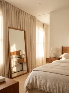
A full-length mirror placed directly across from a window does two jobs at once — it bounces natural light deeper into the room, and it gives you a proper spot to check your outfit before leaving, which otherwise tends to happen awkwardly in a bathroom mirror.
This works in almost any bedroom with a window that gets decent daylight, and it’s especially useful in rooms that feel dim in the mornings.
Lean the mirror rather than mounting it if you want flexibility to move it later, and choose a frame finish that matches your existing wood or metal tones so it doesn’t look like an accessory bolted on as an afterthought. Keep at least a foot of clearance in front of it so it’s actually usable, not just decorative.
The daylight difference is more noticeable than people expect — a west-facing room that felt gloomy in the morning often feels genuinely brighter once a mirror is reflecting that light back across the space.
19. Build a Headboard Wall With Wood Paneling
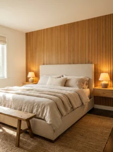
A paneled accent wall behind the bed gives a plain rectangular room a sense of architecture it might not otherwise have, especially in newer builds where walls tend to be flat and featureless.
This suits bedrooms with a plain drywall headboard wall and no existing millwork, crown molding, or texture to lean on.
Vertical slat paneling in a warm wood tone works well in most homes, while horizontal shiplap leans more coastal or farmhouse. Keep the paneling limited to the headboard wall only — covering every wall in the room with the same treatment usually feels heavy rather than cozy. Pair it with simple, unfussy bedding so the wall itself stays the visual focus.
The mistake to watch for is choosing paneling that clashes with existing trim or door frames in the room; matching or complementing the wood tone to what’s already there keeps the room from feeling like two different design decisions stitched together.
20. Create a Compact Layout for a Shared Kids-to-Adult Transition Room
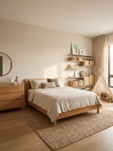
Some bedrooms have to work double duty — a nursery today, a kid’s room in a few years, eventually a guest room. Planning the layout around flexible, non-permanent furniture from the start saves a full redo down the line.
This applies to growing families or anyone furnishing a room they know will change purpose over the next several years.
Choose a bed frame and dresser in a neutral, timeless style rather than anything overtly juvenile, so it transitions without needing replacement. Keep furniture placement centered and simple, since flexible rooms benefit from a layout that isn’t overly customized to one specific use. Modular shelving that can be reconfigured as needs change is worth the slightly higher upfront cost.
The payoff shows up years later, when what could have been a full furniture replacement turns into just changing the bedding and a few accessories instead.
21. Use a Low Platform Bed to Open Up a Room With a Low Ceiling
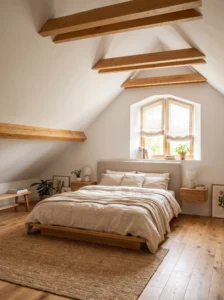
Rooms with low or sloped ceilings, common in attics and converted spaces, feel tighter than they need to when paired with a tall bed frame. Switching to a low platform bed closer to the floor immediately gives the room more visual headroom.
This is worth prioritizing in attic bedrooms, converted lofts, or any room where the ceiling height dips below the standard eight feet.
Look for platform frames under 14 inches at the mattress top, paired with a low, simple headboard rather than a tall, ornate one that would crowd the ceiling line visually. Keep window treatments minimal and light so they don’t add visual weight near the ceiling. Avoid tall dressers or wardrobes on the same wall as the lowest ceiling slope.
The room feels noticeably taller once this change is made, even though the actual ceiling height obviously hasn’t moved — it’s purely a matter of proportion.
22. Position Twin Beds at Right Angles Instead of Parallel
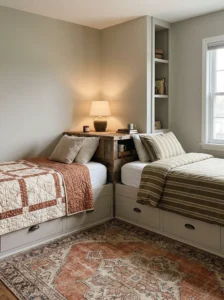
In shared bedrooms, two twin beds pushed against opposite walls can feel more like a dorm room than a shared retreat. Angling them into an L-shape in one corner instead creates a cozier, more sociable feel while still giving each person their own defined space.
This works well in kids’ shared rooms, guest rooms meant for two, or smaller vacation homes where twin beds need to coexist in one space.
Leave enough of a gap at the inside corner for a small shared nightstand or corner shelf, which becomes a natural meeting point between the two spaces. Use coordinating but not identical bedding so each side still feels personal. Keep a rug under both beds to visually tie the L-shape together as one cohesive layout rather than two separate setups.
Parents in particular tend to notice this one works better socially — kids in an L-shaped layout tend to talk to each other before falling asleep instead of feeling isolated at opposite ends of the room.
23. Add a Bay Window Seat as a Layout Anchor
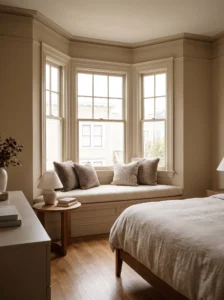
If your bedroom has a bay or bump-out window, building a simple bench seat into it turns an oddly shaped space into one of the room’s best features instead of a layout obstacle to work around.
This applies directly to homes with bay windows, dormer windows, or any recessed window nook that currently sits empty or underused.
Size the bench to fit the exact width of the nook, and choose a cushion depth of at least 20 inches so it’s genuinely comfortable to sit in, not just decorative. Add two or three throw pillows and a small side table if space allows. Keep the surrounding wall color consistent with the rest of the room so the nook feels integrated rather than boxed off.
This is one of those layout fixes where the “before” photo usually shows a pile of laundry or boxes in that exact spot — the space was always there, it just wasn’t being used for anything.
24. Use Vertical Storage Instead of Wide Dressers in Compact Rooms
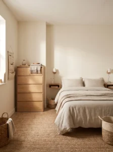
A wide, low dresser eats significant floor space in a small bedroom. Switching to a tall, narrow chest of drawers holds the same amount of clothing in roughly half the footprint, freeing up floor space for walking or a chair.
This is especially useful in bedrooms under 120 square feet, or any room where the dresser currently blocks a natural walking path.
Look for chests around 30 to 34 inches wide but 48 inches or taller, which keeps storage capacity similar to a standard dresser while reclaiming several square feet of floor. Place it in a corner rather than centered on a wall to make the most of an otherwise dead space. Keep the top surface clear or styled minimally, since a tall piece with clutter on top draws the eye upward in a cluttered way.
The floor space gained is often enough to finally fit a chair or bench that wouldn’t have worked with a wider dresser in the same spot.
25. Layer Multiple Light Sources Instead of One Overhead Fixture
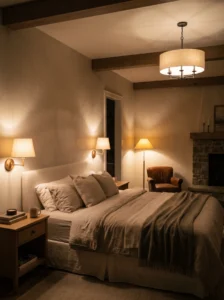
Relying on a single ceiling light in a bedroom creates flat, unflattering light and forces an all-or-nothing lighting decision every night. Layering in bedside lamps, a floor lamp, and dimmable overhead lighting gives you control over the mood depending on the time of day.
This applies to virtually every bedroom, though it matters most in rooms currently lit by a single harsh overhead fixture with no dimmer.
Add at least two bedside light sources, whether lamps or sconces, plus one ambient source like a floor lamp or plug-in wall light in a corner. Choose warm-toned bulbs around 2700K rather than daylight-toned ones for anything in the bedroom. A simple plug-in dimmer switch is an easy retrofit if the overhead fixture isn’t wired to one already.
The shift in how the room feels at 9 p.m. versus how it felt with one bright overhead light on is significant enough that most people never go back to a single-source setup once they’ve tried layering it.
26. Dedicate a Wall to Open Shelving Instead of a Closet Extension
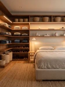
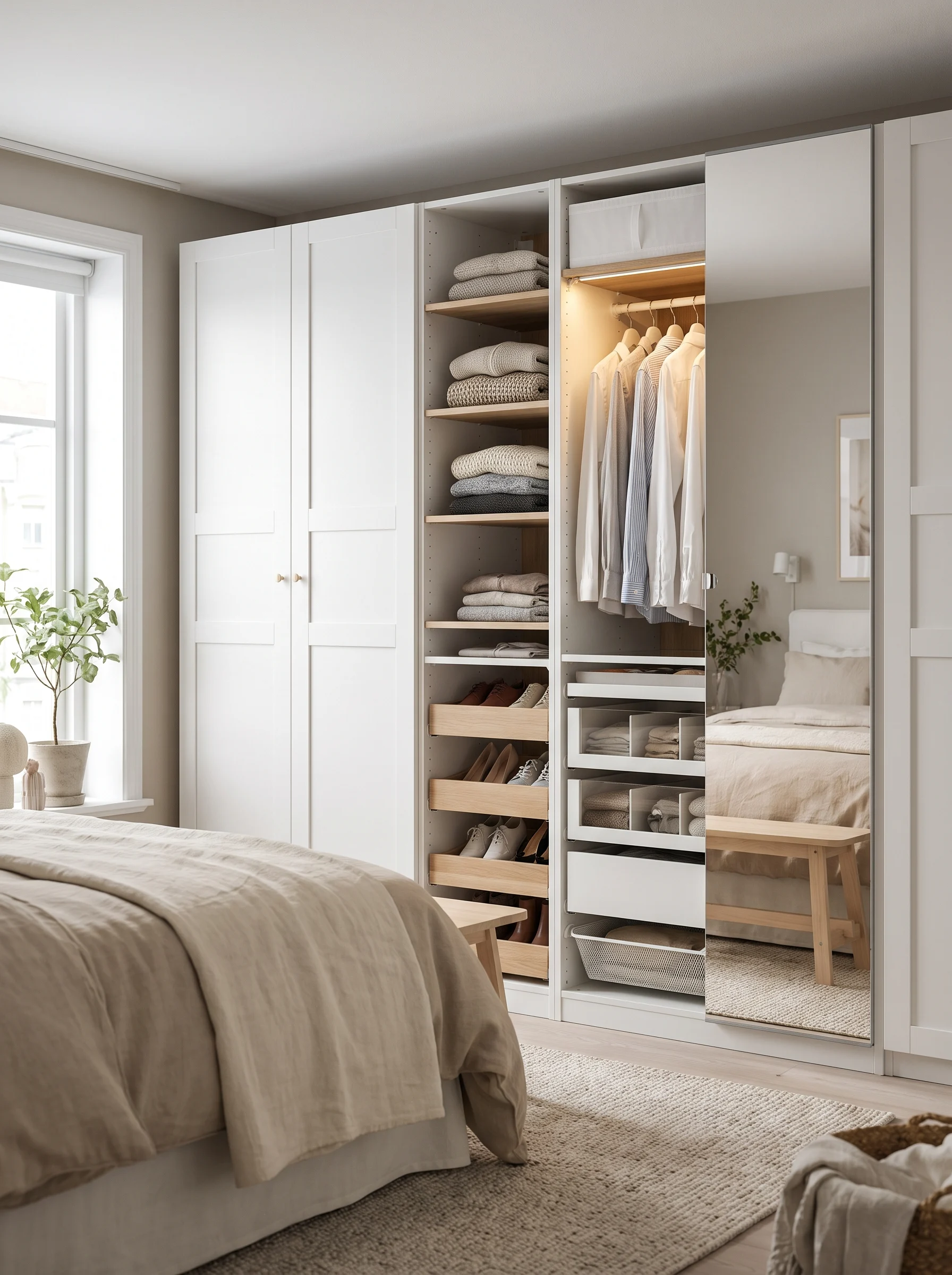
When closet space runs out, the instinct is often to build a wardrobe that eats into the room. An alternative is open shelving along one wall, styled deliberately rather than hidden behind doors, which keeps the room feeling open while still adding real storage.
This suits bedrooms with limited closet space but decent wall length to spare, and works particularly well for people with a curated wardrobe of folded items, shoes, or accessories worth displaying.
Install shelves at varying heights rather than perfectly even spacing, which reads more considered than a rigid grid. Fold clothing neatly and use matching baskets or bins for anything you don’t want on full display. Keep a couple of shelves intentionally sparse rather than filling every inch, since fully packed open shelving starts to look like storage rather than styling.
This only works if you’re willing to keep it tidy, which is worth being honest with yourself about before committing — open shelving rewards discipline and punishes clutter more than a closed wardrobe ever would.
27. Frame the Bed With Matching Pendant Lights Instead of Lamps
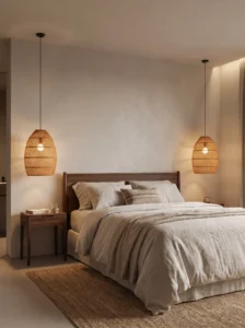
Pendant lights hung on either side of the bed free up the entire nightstand surface and add a more architectural, boutique-hotel look than table lamps typically achieve.
This works well with narrower nightstands, floating shelves, or in rooms where surface clutter has become a recurring frustration.
Hang pendants so the bottom of the shade sits roughly at head height when sitting up in bed, generally 24 to 30 inches above the nightstand surface. Choose fixtures with an adjustable cord length so both sides can be leveled evenly even if the ceiling has any slope. A simple woven or metal shade keeps the look timeless rather than trend-driven.
The nightstand surface stays clear for a book, a glass of water, and little else, which for a lot of people ends up being a more restful setup than a nightstand crowded with a lamp base and cords.
28. Use a Room Divider Screen for Rental-Friendly Zoning
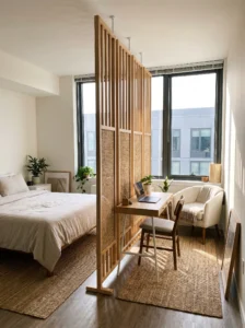
Renters who want a zoned layout without permanent changes can use a folding screen or slatted room divider to separate a sleeping area from a workspace or seating area, without touching the walls at all.
This is ideal for studio apartments, rentals with lease restrictions on construction, or anyone who wants the flexibility to reconfigure the layout later without any cost beyond moving the screen itself.
Choose a divider tall enough to genuinely block sightlines, generally at least 5.5 feet, and place it perpendicular to the wall rather than parallel to maximize the sense of separation. A wood slat or woven design lets some light through, which keeps the room from feeling chopped up. Fold it away entirely on days when you want the open floor plan back.
The flexibility is the entire point here — this is a layout you can undo in thirty seconds if it turns out not to work, which makes it a low-risk way to test a zoned room before committing to anything permanent.
29. Anchor the Room With an Oversized Piece of Art Instead of a Headboard
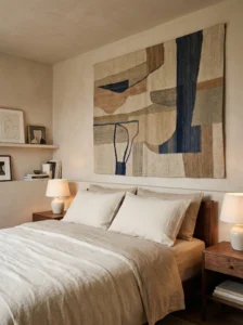
Skipping a traditional headboard altogether and hanging a large piece of art or a fabric tapestry above the bed instead can give a room a more gallery-like, personal feel, and it’s often cheaper than a quality upholstered headboard.
This works particularly well for anyone who already owns or wants to invest in a statement piece of art, and in bedrooms where a heavy headboard would feel like too much visual weight.
Size the art to roughly two-thirds the width of the bed frame so it reads as intentional rather than undersized. Hang it so the bottom edge sits about 8 to 10 inches above the top of the pillows. Keep the wall around it otherwise empty, letting the piece stand alone rather than competing with other art or shelving nearby.
The room ends up feeling less like a furniture showroom and more like an actual reflection of whoever lives there, which is a subtle but real difference once you notice it.
30. Build a Layout Around a Non-Negotiable Piece of Furniture
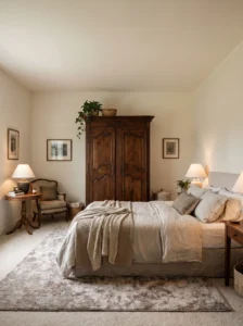
Sometimes a layout has to be planned around one piece that isn’t going anywhere — an inherited dresser, an antique wardrobe, a piano that ended up in the bedroom by necessity. Rather than treating it as a problem, build the rest of the layout to complement it.
This applies to anyone with a large sentimental or oversized piece that doesn’t fit standard layout advice but also isn’t up for negotiation.
Measure the fixed piece first, then plan bed placement and walking paths around it rather than the other way around. Choose secondary furniture in a similar tone or era so the fixed piece doesn’t stick out as mismatched. Give it a moment to shine with focused lighting or a nearby empty wall, rather than crowding it with competing furniture.
Rooms built this way tend to feel more layered and lived-in than rooms designed from a blank slate, mostly because the constraint forces more thoughtful decisions about everything else.
31. Use a Slim Bench Along the Wall Instead of a Full Bench at the Foot
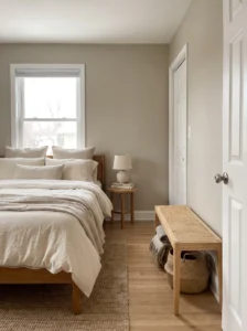
When there isn’t enough clearance for a bench at the foot of the bed, a slim bench pushed against a side wall achieves a similar function — a spot to sit and put on shoes, or somewhere for clothes to land — without needing the extra depth.
This works in rooms where the bed is close to the opposite wall, leaving under 24 inches of clearance at the foot, which rules out a traditional footboard bench.
Choose a bench no deeper than 16 inches so it doesn’t intrude on the walking path along the wall. A backless design in a durable fabric or cane weave keeps it visually light. Position it near the closet or dressing area rather than directly beside the bed, so its function stays clear.
This is a smaller-scale version of idea ten, adapted for rooms that don’t have the foot-of-bed clearance to support a traditional bench, proving the same function can fit almost any room if the shape is adjusted.
32. Design Around a Ceiling Fan Instead of Fighting It
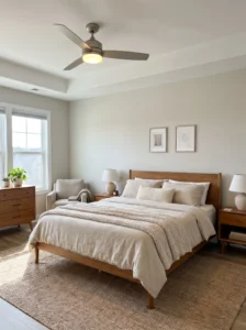
An existing ceiling fan often dictates more of a bedroom’s layout than people realize, since its light and airflow are centered on the room rather than the bed. Working with its position instead of ignoring it usually produces a better result than a layout that pretends the fan isn’t there.
This matters most in warmer climates or older homes where the ceiling fan is a functional necessity, not just a light fixture.
Center the bed under the fan if the room’s proportions allow it, since airflow directly over the bed matters more in summer than most people account for when planning layouts. If centering isn’t possible, at least confirm the fan’s blade span won’t hang directly over a tall headboard or canopy frame. Swap a dated fixture for a low-profile fan with a built-in light if the current one is visually outdated but still functional.
Ignoring the fan and building a layout entirely disconnected from it is one of the more common oversights, and it’s the kind of thing that becomes obvious the first hot night the airflow completely misses the bed.
33. Use a Runner Instead of a Rug in a Narrow Layout
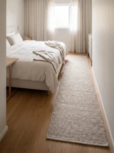
In bedrooms too narrow for a full area rug, a long, narrow runner placed along one side of the bed still adds warmth and softness underfoot without overwhelming the limited floor space.
This suits narrow rooms, layouts with the bed pushed against one wall, or anyone who wants a rug solution but has already ruled out a full-sized area rug due to space.
Choose a runner as long as the bed itself or slightly longer, placed on the side you actually walk on rather than centered under the bed frame. A low pile keeps it from catching on furniture legs in a tight space. Bind or hem the edges properly, since runners in high-traffic areas fray faster than larger rugs that see less concentrated foot traffic.
This is a small, inexpensive fix, but it solves the exact problem a full rug would in a room that simply doesn’t have space for one.
34. Create Depth With a Textured Accent Wall Instead of Paint Alone
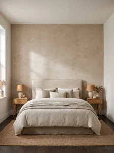
A flat-painted wall behind the bed can look fine, but a textured finish — limewash, a subtle plaster technique, or grasscloth wallpaper — adds a sense of depth that flat paint alone doesn’t achieve, without requiring construction or paneling.
This works in bedrooms where a full renovation isn’t in the budget but a flat, builder-grade wall feels like it’s holding the room back from feeling finished.
Limewash in a warm, muted tone reads as calm rather than trendy, and it’s forgiving of small application imperfections in a way that flat paint isn’t. Grasscloth wallpaper adds texture with less mess but requires more careful installation around outlets and switches. Keep this treatment to the headboard wall only, letting the surrounding walls stay simple so the texture reads as a feature rather than an overwhelming pattern.
The difference shows up mostly in photos taken with natural light, where a textured wall catches shadow and depth in a way a flat painted wall simply can’t replicate.
35. Finish the Layout With Intentional Negative Space
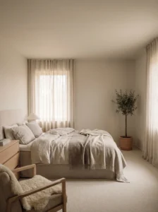
The final and possibly most overlooked layout move is deciding what not to fill. A bedroom with one deliberately empty corner or one bare wall often feels calmer than a room where every available inch has been assigned a piece of furniture.
This applies at the end of any layout project, once the functional pieces — bed, storage, seating — are already placed and the temptation is to keep adding.
Choose one area, ideally a corner or a stretch of wall not directly tied to a functional need, and leave it empty or nearly so, maybe with a single plant or nothing at all. Resist the urge to fill it just because the budget or the space technically allows for more furniture. Step back after finishing the room and ask whether every piece is earning its place, or whether something got added out of habit rather than necessity.
Rooms with a bit of intentional emptiness tend to photograph better and, more importantly, tend to actually feel calmer to walk into, which after all, was the entire point of planning the layout in the first place.
Comparison Table: Layout Approaches at a Glance
| Type | Best Use | Material | Style/Vibe | Difficulty Level |
|---|---|---|---|---|
| Centered Wall Layout | Rectangular rooms, most homes | Standard wood or upholstered frame | Classic, balanced | Easy |
| Floating Bed with Console | Large open bedrooms | Wood console, low bench | Modern, spacious | Moderate |
| Zoned Sleep/Dressing Layout | Large primary suites | Open shelving, low dividers | Hotel-inspired, functional | Moderate to Hard |
| Storage Bed Layout | Small or apartment bedrooms | Upholstered or wood storage frame | Minimal, efficient | Easy |
| Curtain-Enclosed Bed | Studios, open floor plans | Lightweight linen or cotton | Cozy, private | Moderate |
| Reading Nook Addition | Any room with a spare corner | Upholstered chair, wood side table | Relaxed, personal | Easy |
How to Choose the Right Layout for Your Bedroom
Start with the room’s actual dimensions before you fall in love with a Pinterest photo — a layout that looks stunning in a 300-square-foot primary suite can be genuinely unworkable in a 110-square-foot starter bedroom. Measure wall lengths, note where the windows, doors, and closet openings sit, and sketch it out on paper before buying anything. This ten-minute step prevents most expensive layout regrets.
Materials matter more in a bedroom than people assume, mostly because of how much time you spend touching them barefoot or half-asleep. Solid wood bed frames and dressers cost more upfront but hold up for decades, while particleboard pieces tend to sag or chip within a few years of regular use. If budget is tight, spend more on the bed frame — it’s the piece you’ll notice daily — and save on secondary furniture like a bench or side table.
Durability and maintenance go hand in hand with material choice. Upholstered headboards look soft and inviting, but light-colored fabric shows stains fast, especially with kids or pets in the house. A performance fabric or a darker, more forgiving tone solves this without sacrificing the look. Wood furniture with a matte finish hides scuffs better than high-gloss lacquer, which shows every scratch under bedroom lighting.
Budget-wise, the biggest mistake is spending unevenly — a beautiful, expensive bed frame paired with cheap, wobbly nightstands looks worse overall than a modest, well-matched set. Aim for consistency in quality across the pieces that sit together, even if that means a slightly smaller overall budget spread more evenly.
The most common buying regret isn’t about style — it’s about scale. A bed that’s technically the right size for the mattress but too large for the room leaves no breathing room for anything else. Before ordering furniture, tape out the footprint on your bedroom floor with painter’s tape and live with it for a day or two. It sounds excessive, but it catches sizing mistakes that photos and floor plans never reveal.
Final Thoughts
A calmer bedroom rarely comes down to one big purchase — it’s usually a handful of layout decisions working together. Centering the bed on the right wall, adding a bench where clothes were piling up, swapping a lamp for a wall sconce, or finally using that dead corner for a reading chair: none of these changes are dramatic on their own, but stacked together, they shift how the whole room feels to be in.
The layouts in this list aren’t meant to be used all at once. Pick two or three that genuinely fit your room’s shape, your storage needs, and how you actually use the space day to day. A bedroom built around real habits — where you read, how you get dressed, whether you share the space with a partner or pet — will always feel more comfortable than one copied wholesale from a photo.
Measure before you buy, prioritize the pieces you touch most often, and don’t be afraid to leave a corner empty if it doesn’t need to be filled. The goal isn’t a room that looks finished in a photograph. It’s a room that makes going to bed at night, and getting out of it in the morning, a little easier than it was before.
Frequently Asked Questions
What’s the ideal amount of walking space around a bed?
Aim for at least 24 inches of clearance on each side you regularly walk through, and closer to 36 inches if you want room for a bench or chair at the foot. Anything tighter than 18 inches starts to feel cramped and makes the bed hard to make up properly.
Should nightstands always match?
Not always — matching nightstands create symmetry and a calmer feel, but mismatched ones can work well in eclectic or personality-driven rooms. The key is keeping them similar in height so the lamps and lighting still line up visually.
How do I make a small bedroom feel bigger without a renovation?
Focus on furniture that does double duty, like a storage bed or built-in nightstands, and keep the color palette light and consistent. Mirrors placed opposite a window also bounce natural light around and make the room read larger than it is.
Is it worth buying a bed frame with built-in storage?
Yes, if floor space is limited and you don’t already have a dresser that fits comfortably. Just be aware that side-drawer storage beds are easier to access daily than lift-up platform styles, which require moving the mattress.
How often should bedroom layouts be updated?
There’s no fixed timeline, but it’s worth reassessing anytime your routine changes significantly — a new partner, a pet, a shift to working from home, or simply outgrowing furniture that no longer fits your needs.
What’s the biggest mistake people make with bedroom layouts?
Pushing the bed into a corner to “save space” without checking whether it actually improves flow. This often just creates an awkward gap on one side and makes the bed harder to make and access.
Do rugs really make a difference in a bedroom?
Yes, both visually and functionally. A properly sized rug anchors the furniture and adds warmth underfoot, especially over hardwood or tile, and layering two rugs is a low-cost way to add texture without redoing the whole floor.
Can I mix layout styles, like a reading nook and a zoned dressing area, in one room?
Absolutely, as long as the room has enough square footage to support both without feeling cluttered. Start with one addition, live with it for a few weeks, and add the second only if the room still has breathing room.