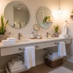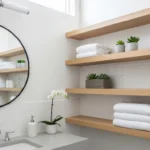
A bathroom might be one of the smallest rooms in the house, but it has a surprisingly big impact on how your home feels. It’s often the first room you step into in the morning and one of the last places you visit before bed. Yet many bathrooms end up feeling dull, outdated, or simply uninspiring because of one overlooked design choice: color.
The challenge is that bathroom color trends change constantly. One year everyone wants bright white spaces, and the next year earthy tones dominate design magazines. As a result, many homeowners struggle to choose a color that feels stylish without becoming outdated too quickly.
The good news is that the right bathroom color doesn’t just improve appearance—it can completely change how the room feels. A well-chosen shade can make a small bathroom seem larger, create a spa-like atmosphere, add warmth to a cold space, or bring personality to an otherwise basic design.
In this guide, you’ll discover 15 bathroom color ideas that can instantly refresh your space. From timeless neutrals to bold statement shades, each option includes practical tips, design advice, and real-world insights to help you choose a color that works for your home and lifestyle. Whether you’re planning a full renovation or simply repainting the walls, these ideas can help you create a bathroom that feels cleaner, brighter, and more enjoyable to use every day.
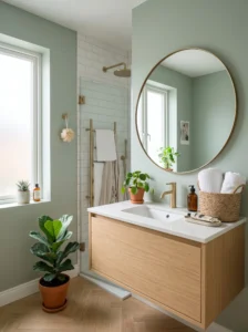
1. Soft Sage Green
Soft sage green has become a favorite for good reason—it feels calm without being boring.
This muted green works because it brings a touch of nature indoors. Bathrooms often contain hard surfaces like tile, glass, and porcelain, and sage green helps soften the overall look. It creates a peaceful atmosphere that’s ideal for starting and ending your day.
Sage works especially well in medium-sized bathrooms with good natural light. Pair it with white subway tile, light wood vanities, and brushed brass fixtures for a balanced look.
One common mistake is choosing a green that’s too dark or too yellow. Look for muted, gray-toned sage shades that feel subtle rather than overwhelming.
In everyday use, sage green tends to feel relaxing rather than trendy. Many homeowners find it creates a spa-like environment without requiring expensive upgrades.
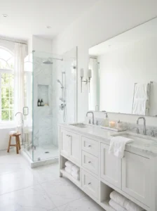
2. Crisp White
Sometimes the simplest choice remains the most effective.
White bathrooms feel clean, bright, and timeless. The color reflects light exceptionally well, making even the smallest bathroom feel larger and more open. That’s why white remains a favorite in apartments, guest bathrooms, and powder rooms.
The key to making white work is layering textures. Combine glossy tiles, matte paint, natural wood accents, and soft towels to prevent the room from feeling sterile.
Avoid using only one shade of white throughout the room. Mixing warm whites and cool whites can create visual depth while maintaining a fresh appearance.
The practical benefit is obvious: white instantly signals cleanliness. While it may require more frequent cleaning, it also helps you notice dirt and water spots quickly.
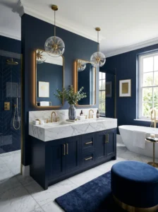
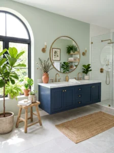
3. Navy Blue
Navy blue proves that bathrooms don’t always have to be light and airy.
This rich shade adds sophistication and depth. It works particularly well when paired with white trim, marble countertops, or gold fixtures. The contrast creates a polished and luxurious look.
Navy is best suited for larger bathrooms or spaces with plenty of lighting. In very small rooms, it can feel a little heavy unless balanced with lighter surfaces.
Consider using navy on vanity cabinets or a feature wall rather than covering every surface. This creates drama without making the room feel enclosed.
Many people are surprised by how elegant navy feels during everyday use. It hides minor marks better than lighter colors and gives the bathroom a more custom-designed appearance.
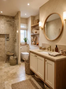
4. Warm Beige
Beige has quietly made a comeback, and today’s versions look much more sophisticated than the beige bathrooms of the past.
Warm beige works because it creates comfort. Unlike stark white, it introduces subtle warmth while remaining neutral enough to complement various materials and styles.
This color is particularly useful in bathrooms that receive limited natural light. It prevents the space from feeling cold or clinical.
Pair beige with natural stone, woven baskets, and warm metallic finishes. Avoid combining it with overly cool gray tones, which can make the room feel mismatched.
A warm beige bathroom often feels welcoming and comfortable, making daily routines more pleasant and relaxed.
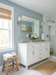
5. Dusty Blue
Dusty blue offers a fresh alternative to traditional neutrals.
This soft shade creates a sense of tranquility without feeling overly colorful. It combines the calming effect of blue with the versatility of a neutral tone.
Dusty blue works beautifully in coastal-inspired, modern farmhouse, and transitional bathrooms. White fixtures and light wood finishes complement it particularly well.
Avoid pairing it with too many bright primary colors. Keeping the surrounding palette soft allows the color to maintain its calming effect.
Many homeowners appreciate how dusty blue feels refreshing every season. It stays cool in summer and cozy during colder months.
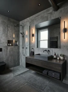
6. Charcoal Gray
For a bold and modern look, charcoal gray is hard to beat.
This deep neutral adds drama while remaining versatile. It creates a sophisticated backdrop for white sinks, mirrors, and metallic fixtures.
Charcoal works best in larger bathrooms or spaces with strong lighting. Using it on a single accent wall can prevent smaller bathrooms from feeling cramped.
Balance dark walls with lighter flooring and reflective surfaces. Large mirrors are particularly effective in maintaining brightness.
The result is a bathroom that feels upscale and contemporary without relying on trendy design elements.
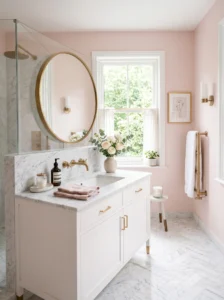
7. Pale Blush Pink
Blush pink has evolved far beyond children’s rooms.
Modern blush tones are subtle, elegant, and surprisingly versatile. They add warmth and softness while remaining sophisticated enough for adult spaces.
This shade works especially well in bathrooms with white marble, brass hardware, or natural wood finishes.
Avoid bright bubblegum pinks if you’re aiming for a refined appearance. Muted, dusty pinks feel more timeless and easier to decorate around.
A blush bathroom often feels warmer and more inviting than traditional neutral spaces, especially during colder months.
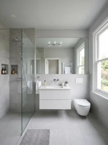
8. Light Gray
Light gray remains a reliable choice for contemporary bathrooms.
It provides the neutrality of white while adding a bit more visual interest. Light gray also complements nearly every fixture finish, from chrome to black hardware.
This color works in bathrooms of virtually any size. It can serve as a backdrop for colorful accessories or stand alone in a minimalist design.
The biggest mistake is choosing a gray with the wrong undertones. Test samples carefully to avoid colors that appear too blue or purple under bathroom lighting.
Many homeowners appreciate how adaptable light gray remains over time, even as decor trends change.
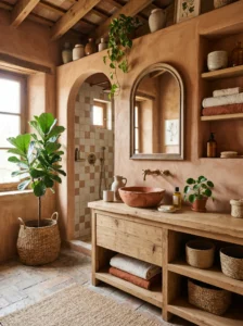
9. Terracotta
Terracotta brings warmth and character that many modern bathrooms lack.
Inspired by natural clay tones, this earthy color creates a cozy atmosphere while adding visual depth. It works particularly well in bohemian, Mediterranean, and organic modern designs.
Pair terracotta with cream walls, natural wood, and textured accessories. Plants also look especially vibrant against this warm backdrop.
Use terracotta thoughtfully. Too much can feel overwhelming, so consider incorporating it through feature walls or cabinetry.
The result is a bathroom that feels grounded, welcoming, and full of personality.
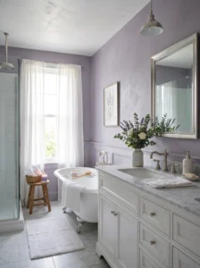
10. Soft Lavender
Lavender can create a surprisingly sophisticated bathroom.
The key is choosing muted lavender tones rather than bright purples. Soft lavender adds subtle color while maintaining a calm and relaxing atmosphere.
This shade pairs beautifully with white tile, silver fixtures, and light gray accents. It works particularly well in bathrooms designed for relaxation and self-care.
Avoid combining it with too many competing colors. Simplicity helps lavender feel elegant rather than playful.
Many people find that soft lavender adds personality without overwhelming the room.
11. Earthy Taupe
Taupe offers the perfect balance between gray and beige.
This versatile neutral brings warmth and depth while remaining understated. It’s ideal for homeowners who want something more interesting than white but less noticeable than bold colors.
Taupe works exceptionally well with stone countertops, wood cabinetry, and black fixtures.
Choose shades with warm undertones to keep the room feeling inviting. Cool taupes can sometimes appear dull under artificial lighting.
The everyday advantage is that taupe hides minor dirt and water spots better than lighter shades.
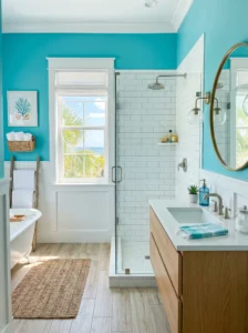
12. Aqua Blue
Aqua instantly creates a refreshing atmosphere.
Because it resembles water, the color naturally feels at home in bathrooms. It brings energy and brightness while maintaining a relaxing quality.
Aqua works particularly well in beach-inspired designs and bathrooms with plenty of natural light.
Balance the color with white surfaces and simple accessories. Too many competing colors can make the space feel busy.
Aqua often makes morning routines feel a little more cheerful and energizing.
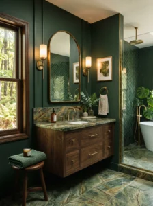
13. Forest Green
Forest green adds richness and sophistication.
Unlike lighter greens, it creates a more dramatic and luxurious atmosphere. It pairs beautifully with brass fixtures, marble surfaces, and dark wood tones.
This color works best in larger bathrooms or spaces with strong lighting. Consider using it on vanity cabinets if painting the entire room feels too bold.
Avoid overcrowding the room with heavy decor. Let the color serve as the main statement.
The result is a bathroom that feels elegant and distinctive.
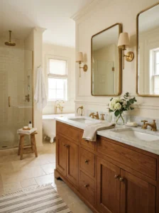
14. Creamy Ivory
Ivory offers the brightness of white with added warmth.
It works exceptionally well in traditional, farmhouse, and transitional bathrooms. The softer tone creates a welcoming atmosphere while maintaining a clean appearance.
Pair ivory with warm woods, natural stone, and brass fixtures. These materials enhance its cozy character.
Avoid mixing ivory with bright cool whites, as the contrast can appear unintentional.
Many homeowners find ivory easier to live with than pure white because it feels less stark and more forgiving.
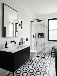
15. Black and White Contrast
Few color combinations are as timeless as black and white.
This classic pairing creates strong visual impact while remaining versatile enough for virtually any design style. Black adds depth, while white maintains brightness.
Use black sparingly through vanities, fixtures, mirrors, or accent walls. Too much black can make small bathrooms feel enclosed.
Geometric tile patterns work particularly well with this color combination. They add visual interest without requiring additional colors.
A black-and-white bathroom often feels stylish for years, making it a smart long-term choice.