Most people blame stress, screen time, or noisy neighbors for bad sleep, but very few stop to think about the color of the room they sleep in every night. That’s surprising because color quietly affects mood, energy levels, and even how relaxed your brain feels before bed. A bedroom painted in the wrong shade can feel mentally “loud” even when everything else is perfectly organized.
A lot of modern bedrooms look beautiful in photos but don’t actually feel restful in real life. Bright white walls can feel sterile, dark colors can sometimes feel heavy, and trendy neon tones may look exciting online but become exhausting after a few weeks. Sleep-friendly design is less about following trends and more about creating a space that tells your brain it’s time to slow down.
The good news is that you don’t need a luxury makeover to create a calming bedroom. Sometimes changing the wall color, bedding palette, or even accent shades can completely shift how a room feels at night. The best sleep colors are usually the ones that reduce visual stress and create emotional comfort.
In this guide, you’ll learn the best bedroom colors for improving sleep, why they work psychologically, where they work best, and how to use them without making your room look dull or outdated. You’ll also get practical decorating advice, common mistakes to avoid, a comparison table, FAQs, and image prompts you can use for blog visuals or Pinterest graphics.

1. Soft Blue Creates the Most Naturally Relaxing Atmosphere
Soft blue is probably the closest thing to a universally calming bedroom color. There’s a reason hospitals, spas, and wellness spaces often use muted blue tones. The color naturally reminds people of the sky and water, which creates a subtle feeling of calm and openness.
This works especially well in bedrooms where stress follows you from work into your personal space. A dusty blue or pale gray-blue helps visually slow the room down. Unlike bright blue shades, softer versions don’t overstimulate the eyes before sleep.
Soft blue works best in medium-sized or small bedrooms because it visually expands the room without making it feel cold. Pair it with warm lighting, beige curtains, oak furniture, and textured bedding so the space feels balanced instead of icy.
One mistake people make is using overly saturated navy on every wall. Dark blue can look elegant, but too much of it can make a room feel heavy at night. It’s better used as an accent.
In real life, soft blue bedrooms often feel cleaner and more peaceful without trying too hard. Even on stressful days, the room feels like a calm reset button instead of another mentally busy space.
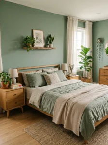
2. Sage Green Helps the Mind Feel Grounded
Sage green has become extremely popular recently, but unlike many trends, this one actually makes sense for sleep. Green is strongly connected to nature, balance, and restoration. Sage specifically works because it’s muted rather than bright.
Bedrooms painted in sage green often feel emotionally softer. The shade doesn’t demand attention, which is exactly what you want in a sleep space. It creates a calm background that works with many decor styles including modern, rustic, Japandi, and farmhouse interiors.
This color works especially well in rooms with natural light because sunlight enhances the earthy undertones. If your bedroom has plants, wooden furniture, or linen textures, sage green ties everything together beautifully.
Avoid pairing sage with overly cool gray furniture because the room can start feeling flat. Instead, combine it with cream, warm white, soft brown, or matte black accents for depth.
A practical tip is to use sage green on walls while keeping bedding neutral. Too much green everywhere can feel visually repetitive.
People often say sage green bedrooms feel “quiet” in the best possible way. It creates a subtle sense of comfort that makes winding down easier at night.
3. Warm Beige Makes a Bedroom Feel Safe and Comfortable
Beige sometimes gets unfairly labeled as boring, but in bedrooms, boring can actually be a good thing. Sleep spaces don’t always need dramatic personality. Warm beige creates emotional warmth without visual chaos.
Unlike bright white walls that can feel harsh under artificial light, beige softens everything. It reflects light gently and makes a room feel cozy instead of clinical. This is especially helpful in apartments or homes with limited natural sunlight.
Warm beige works well in almost every bedroom size and style. It’s ideal for people who change decor often because it pairs easily with different bedding colors, rugs, and furniture finishes.
The key is choosing the right beige. Avoid yellow-heavy beige tones because they can feel dated. Look for sandy, oatmeal, or mushroom-inspired shades instead.
Layering textures matters here. Linen curtains, boucle chairs, knitted throws, and wooden nightstands stop beige rooms from feeling plain.
In daily life, beige bedrooms often feel emotionally stable. They don’t overstimulate you at night or feel visually tiring in the morning. That balance is exactly why so many luxury hotels use warm neutral palettes.
4. Lavender Encourages a Softer Evening Mood
Lavender works surprisingly well for sleep because it combines the calmness of blue with the warmth of subtle purple undertones. The result feels soothing without becoming cold or dull.
This shade is particularly effective for people who want a bedroom with personality but still need a relaxing atmosphere. Lavender feels gentle and slightly romantic without becoming overly feminine when styled correctly.
It works best in bedrooms with soft fabrics and warm lighting. Pair it with cream bedding, brushed gold accents, or light wood furniture for a balanced look.
One common mistake is choosing bright purple instead of muted lavender. Vibrant purple shades can feel energetic rather than calming. Always lean toward dusty or gray-based lavender tones.
Lavender also works beautifully in guest bedrooms because it feels welcoming and restful to most people.
In real homes, lavender bedrooms often feel more peaceful in the evening compared to daytime. As warm lamps turn on at night, the color becomes softer and more relaxing, which naturally supports bedtime routines.
5. Pale Gray Works Well When Balanced Correctly
Gray bedrooms can either feel incredibly relaxing or strangely depressing depending on how they’re styled. The secret is warmth.
Cool-toned gray with blue undertones can sometimes feel emotionally cold, especially in rooms with poor lighting. But warm pale gray creates a quiet, modern atmosphere that many people find restful.
This color works especially well in minimalist bedrooms because it reduces visual clutter. If your room already contains lots of patterns, electronics, or furniture, pale gray helps calm the environment visually.
The best approach is combining gray with warm textures. Think cream rugs, soft cotton bedding, wood furniture, and warm white lamps.
Avoid using dark charcoal on every wall unless the room gets plenty of natural light. Too much darkness can make waking up harder, especially during winter.
A well-balanced gray bedroom often feels mature and calm. It’s particularly good for adults who want a clean, hotel-inspired sleep environment without strong colors dominating the space.
6. Dusty Pink Feels Calming Without Being Overwhelming
Dusty pink is softer and more sophisticated than people expect. Unlike bright pink shades, muted blush tones create warmth and emotional comfort.
This color works especially well in bedrooms that feel emotionally cold or sterile. A dusty pink wall can instantly make the room feel more inviting without becoming childish.
It pairs beautifully with beige, walnut wood, cream, and soft gray accents. Matte finishes work best because glossy pink walls can feel too energetic.
One smart design trick is using dusty pink as an accent wall behind the bed rather than covering the entire room. This keeps the space balanced and visually relaxing.
In daily life, dusty pink bedrooms often feel surprisingly peaceful. The color reflects warm lighting beautifully at night, creating a cozy evening atmosphere that encourages relaxation.
7. Muted White Can Improve Sleep Better Than Bright White
Not all white bedrooms are equal. Bright, cold white often feels like an office or hospital, while muted white feels soft and restful.
The best sleep-friendly whites usually have creamy, warm, or slightly beige undertones. These shades reflect light gently rather than harshly.
Muted white works especially well in small bedrooms because it keeps the room feeling open without becoming visually intense. It also helps if you like changing decor seasonally since white works with everything.
Texture becomes very important here. Without layered textures, white bedrooms can feel empty. Use woven rugs, soft bedding, wooden decor, and fabric curtains to add warmth.
Avoid cool LED lighting in white bedrooms because it creates a sterile feeling. Warm lighting completely changes the mood.
A good muted white bedroom feels clean but still emotionally comfortable. That balance is what helps the room feel relaxing rather than lifeless.
8. Earthy Brown Creates a Cozy Sleeping Environment
Brown tones are making a huge comeback in interior design because people are craving warmer, more comforting spaces. Earthy brown shades feel grounded and secure.
This works particularly well in large bedrooms that feel too open or emotionally cold. Brown visually “warms up” the space and makes it feel more intimate.
The best tones include clay, cocoa, mushroom brown, and taupe-inspired shades. Avoid overly dark chocolate walls unless the room has excellent lighting.
Earthy browns pair beautifully with cream bedding, olive green accents, and natural wood furniture.
A practical tip is using brown through decor elements instead of painting every wall dark brown. Upholstered headboards, curtains, or rugs often create enough warmth on their own.
In real life, earthy bedrooms often feel more emotionally comforting during nighttime. They create a cocoon-like feeling that makes resting easier.
9. Light Teal Balances Calmness and Personality
Teal sits between blue and green, which makes it naturally balanced. A muted light teal brings freshness into a bedroom without becoming overly stimulating.
This shade works especially well for people who find plain neutrals too boring but still want a calming sleep environment.
The key is keeping teal soft and slightly gray-based. Bright tropical teal can feel too energetic for nighttime spaces.
Light teal works beautifully in coastal, modern, or bohemian bedrooms. Pair it with white linens, rattan textures, and soft natural lighting.
One mistake is combining teal with too many bold accent colors. Keep the palette simple so the room stays relaxing.
A good teal bedroom often feels refreshing during the day and calming at night, which makes the room versatile rather than sleepy-looking all the time.
10. Greige Offers the Best of Gray and Beige
Greige — the mix of gray and beige — has become a favorite among interior designers because it solves the problems both colors can create individually.
Pure gray sometimes feels cold, while beige can occasionally feel too warm or dated. Greige lands comfortably in the middle.
This shade works in almost every bedroom style and lighting condition. It’s especially good for renters or homeowners who want a timeless color that won’t feel trendy next year.
Greige pairs beautifully with black accents, white bedding, wood textures, and soft metallic finishes.
Avoid choosing greige shades that lean too purple because they can look strange under artificial lighting.
In everyday life, greige bedrooms usually feel balanced and emotionally easy to live with. They rarely feel overwhelming, which is exactly what makes them good for sleep.
11. Soft Peach Creates Gentle Warmth
Soft peach adds warmth without the heaviness that darker warm colors sometimes create. It reflects light beautifully and gives bedrooms a naturally cozy feeling.
This works best in rooms that feel dark or emotionally flat. Peach subtly brightens the environment while still feeling calm.
Muted peach tones pair nicely with cream, tan, light wood, and brushed brass finishes.
The biggest mistake is choosing overly orange peach shades. Those can feel energetic rather than relaxing. Stick with dusty or pastel-inspired peach.
Soft peach bedrooms often feel cheerful without being loud. That emotional warmth can actually help create a more comforting nighttime environment.
12. Navy Blue Works Best as an Accent
Navy blue can look incredibly sophisticated in a bedroom, but too much of it may feel heavy or cave-like.
The best way to use navy for sleep improvement is strategically. An accent wall behind the bed or navy bedding creates depth without overwhelming the room.
Navy works particularly well in larger bedrooms with plenty of natural light. Pair it with warm wood, cream textiles, and brass lighting for balance.
Avoid combining navy with stark white because the contrast can feel visually sharp. Softer whites and warm neutrals work better.
A navy accent often makes bedrooms feel luxurious and cozy at the same time, especially during nighttime when lighting becomes softer.
13. Charcoal Can Feel Restful in the Right Space
Charcoal is bold, but when used carefully, it creates a cocoon-like atmosphere that some people find deeply relaxing.
This works best in larger bedrooms or rooms with big windows. In tiny dark spaces, charcoal can feel oppressive instead of calming.
Balance is everything here. Use charcoal on one wall or through furniture pieces rather than making the entire room dark.
Soft lighting becomes essential. Warm bedside lamps, textured fabrics, and layered bedding stop charcoal rooms from feeling gloomy.
In real life, charcoal bedrooms often feel incredibly quiet at night. They absorb light rather than reflecting it, which creates a naturally restful environment.
14. Olive Green Adds Depth Without Stress
Olive green is deeper and moodier than sage, but still connected to nature. It creates richness without becoming visually chaotic.
This shade works beautifully in bedrooms with wood furniture, leather accents, or vintage-inspired decor.
Olive green feels especially cozy during nighttime because warm lighting enhances its earthy tones.
One practical tip is balancing olive walls with lighter bedding and curtains so the room doesn’t feel too dark.
Many people find olive green emotionally comforting because it feels natural and grounded rather than trendy or artificial.
15. Avoid Bright Red, Neon, and Harsh Yellow
Sometimes the best sleep color advice is knowing what to avoid. Bright red, neon shades, and intense yellows often overstimulate the brain.
Red increases energy and visual intensity. Neon colors create mental stimulation. Strong yellow can feel emotionally loud over time.
These shades may work in gyms, cafes, or creative studios, but bedrooms need calmness more than excitement.
If you love bold colors, use them in small decor pieces instead of dominant wall colors.
A bedroom should help your nervous system relax, not feel like a constant source of visual activity.

Comparison Table
| Color Type | Best Use | Material Pairing | Style/Vibe | Difficulty Level |
|---|---|---|---|---|
| Soft Blue | Small and medium bedrooms | Linen, oak wood | Calm and airy | Easy |
| Sage Green | Nature-inspired rooms | Wood, cotton, rattan | Organic and peaceful | Easy |
| Warm Beige | Low-light bedrooms | Boucle, wool, wood | Cozy and timeless | Very Easy |
| Lavender | Guest and relaxing bedrooms | Velvet, cream fabrics | Soft and elegant | Medium |
| Greige | Modern minimalist spaces | Matte finishes, wood | Balanced and modern | Easy |
| Navy Accent | Large bedrooms | Brass, dark wood | Luxurious and cozy | Medium |
Buying Guide / How to Choose Bedroom Colors for Better Sleep
Choosing the best bedroom color is less about trends and more about understanding how the room actually feels during daily life. A paint color that looks beautiful online may feel completely different once it’s covering four walls in your own home.
Start by thinking about room size and lighting. Smaller bedrooms usually benefit from lighter shades like soft blue, muted white, or warm beige because they reflect light and make the space feel more open. Large bedrooms can handle deeper tones like olive green or navy accents without feeling cramped.
Lighting matters more than people realize. North-facing rooms often look cooler, so warm tones like greige, peach, or beige usually work better. South-facing rooms can handle cooler shades more easily because natural sunlight balances them out.
Material choices also affect how colors feel. Matte paint finishes create a softer and more relaxing atmosphere than glossy finishes. Natural materials like linen, cotton, wood, and woven textures help calming colors feel warmer and more inviting.
Durability is another important factor. Dark colors show dust more easily, while bright white walls often reveal scuffs and marks quickly. Mid-tone shades like sage green or greige are usually easier to maintain over time.
Budget-wise, changing wall color is one of the most affordable bedroom upgrades. If repainting isn’t possible, you can still introduce calming colors through bedding, curtains, rugs, and artwork.
One common mistake is copying trendy bedrooms directly from social media without considering real-life comfort. Another mistake is using too many strong colors together. Bedrooms usually feel best when the palette stays simple and cohesive.
At the end of the day, the best bedroom color is the one that helps your mind feel quieter when the lights go off.
Conclusion
The best bedroom color for improving sleep isn’t necessarily the trendiest one. It’s the color that makes your space feel calm, emotionally comfortable, and visually restful after a long day.
Soft blues, sage greens, warm beiges, muted whites, and gentle earth tones consistently work well because they reduce visual stress instead of adding more stimulation. These colors help create a bedroom that feels like an actual place to rest rather than just another decorated room.
What matters most is balance. Even calming colors can feel uncomfortable if the lighting is harsh, the furniture is cluttered, or the textures feel cold. A relaxing bedroom usually combines soft colors with warm materials, layered fabrics, and simple styling choices.
You also don’t need a complete renovation to improve sleep through color. Small changes like switching bedding, repainting one wall, or replacing bright decor pieces can noticeably shift the mood of the room.
A good bedroom should support rest naturally. When the colors feel calm and balanced, your space becomes easier to relax in — and that often makes a bigger difference than people expect.
FAQs
1. What is the most relaxing bedroom color for sleep?
Soft blue is often considered the most relaxing bedroom color because it creates a calm and peaceful atmosphere. Sage green and warm beige are also excellent choices for reducing visual stress.
2. Are dark bedroom colors bad for sleep?
Not always. Dark colors like navy or charcoal can feel cozy and restful when balanced with warm lighting and soft textures. Problems usually happen when the room becomes too dark or visually heavy.
3. Should bedroom ceilings be the same color as walls?
In most cases, slightly lighter ceilings work best because they keep the room feeling open. Matching ceilings can work in cozy or dramatic spaces but may feel heavy in small bedrooms.
4. Is white a good bedroom color?
Muted or warm white works very well for bedrooms. Bright cool white can sometimes feel sterile or harsh, especially under LED lighting.
5. What colors should be avoided in bedrooms?
Bright red, neon colors, and harsh yellows are usually too stimulating for sleep spaces. These shades can increase visual energy instead of promoting relaxation.
6. Can bedroom color really affect sleep quality?
Color alone won’t fix sleep problems, but it can influence mood and relaxation levels. A calm visual environment helps support better nighttime routines and mental comfort.
7. What is the best bedroom color for small rooms?
Soft blue, warm white, greige, and light sage green work especially well in small bedrooms because they make the space feel brighter and more open.
8. How can I add calming colors without repainting?
You can use calming colors through bedding, curtains, rugs, artwork, throw pillows, or upholstered furniture. Even small color changes can improve the room’s overall atmosphere.