The first time most people try mosaic, they buy a bag of tiles, spread them across the table, and then just stare. Without a plan, a pile of little squares looks like a pile of little squares. That blank-page feeling is where a lot of beginner projects quietly stall.
Square tiles are the easiest place to start, and there’s a practical reason. Straight edges line up without much cutting, spacing stays predictable, and mistakes are easy to spot before the adhesive sets. Curves, tiny shards, and freehand pictures can wait. A grid gives you structure, and structure is what turns a hobby into something you actually finish.
What people tend to underestimate is how much the pattern does the heavy lifting. Two colors arranged well can look more considered than twenty colors tossed together. The pattern decides whether a coaster looks charming or chaotic, and whether a backsplash looks tailored or busy.
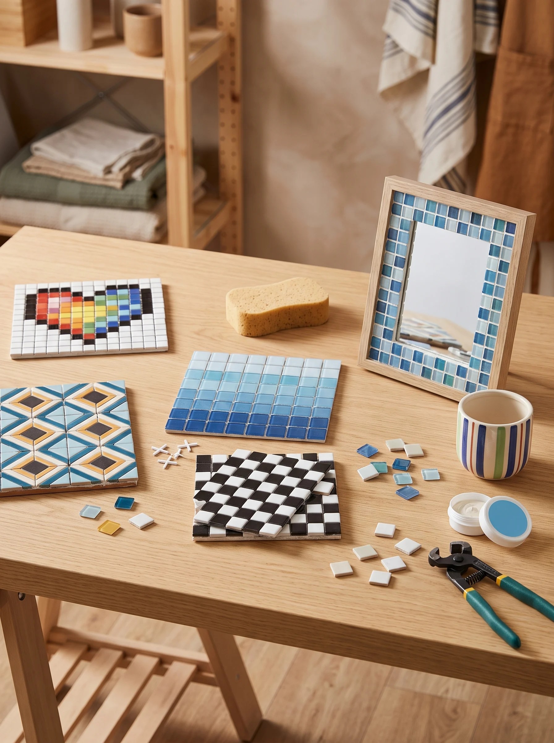
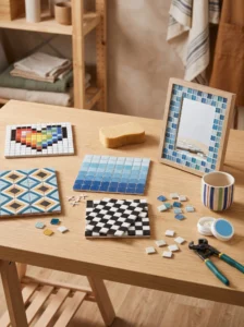
This guide walks through 15 easy square mosaic patterns for beginners, from a classic checkerboard to stepped zigzags and a tiny pixel heart. Each one covers where it works, how to size and color it, and what usually goes wrong. After the patterns you’ll find a comparison table, a short buying guide for tiles and supplies, and answers to the questions beginners ask most. Pick a pattern, grab a few sheets of tile, and start small.
1. Classic Checkerboard
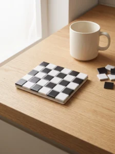
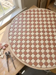
A checkerboard is the pattern to learn on, because it teaches spacing, contrast, and grouting in one small project. Two colors, alternating squares, nothing hidden.
It suits coasters, trivets, small tabletops, and entry floor insets. Start with an eight-by-eight grid on a coaster-sized base, which gives you a recognizable board without too many tiles. For a bigger piece, keep an even number of squares per side so the corners match.
Pick colors with real contrast. Black and white is the safe route, but deep teal with cream, or terracotta with sand, feels fresher. Two similar shades blur together once grout goes in.
Dry-fit the whole grid before gluing anything. Leave a consistent gap, about an eighth of an inch, and use a cardboard spacer instead of judging by eye. Small drifts add up across eight rows.
The common mistake is starting in one corner and discovering the last row is short. Begin at the center and work outward.
On a kitchen counter, a checkerboard trivet gets used constantly because it’s flat, wipeable, and sturdy, and that daily use is what makes a first project feel worth the effort.
2. Straight Grid With Contrasting Grout
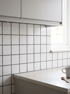
Sometimes the simplest layout is the smartest. A plain grid of same-sized square tiles, set in straight rows and columns, lets the grout color become the pattern.
This works on backsplashes, shower niches, and small wall panels where clean lines matter. One-inch glass or ceramic squares sold on mesh sheets are the easiest format, since the spacing is already built in. Press a sheet into adhesive, check it against a level, and move on to the next.
Grout choice shapes the look. White grout feels crisp and traditional, while charcoal grout makes the tiles stand out and hides stains better. Light tiles with dark grout read graphic and modern.
Keep sheet edges aligned. Each mesh sheet should sit flush against its neighbor, otherwise the seam shows up as a wider gap.
Use unsanded grout for narrow joints under about an eighth of an inch and sanded grout for wider ones. Mixing those up is a common beginner stumble.
In a bathroom, this layout is forgiving and easy to keep clean, since there’s no busy pattern to interrupt a wipe-down.
3. Ombré Rows From Light to Dark
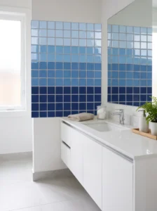
Ombré rows take one color family and step it from light to dark, giving a soft gradient with almost no design skill. Each row is a single shade, so there’s nothing complicated to follow.
Choose five to seven shades of one hue. Blues and greens suit bathrooms, while sand-to-terracotta runs suit kitchens. Glass mosaic sheets often come in graduated sets, which saves a lot of sorting.
Lay the rows horizontally for a calm look or vertically to draw the eye upward. Horizontal bands widen a short wall, while vertical ones make a low ceiling feel taller.
Order the tiles on a flat surface before committing, and photograph the layout. Phone photos flatten the color and reveal jumps your eye misses.
The usual problem is uneven steps, where one shade is much darker than its neighbor. Fix it by adding an in-between tone or dropping the odd one out.
Matte and glossy finishes can mix here, but keep each row consistent so the shift reads as color, not texture.
A gradient behind a sink or stove also hides splashes better than one flat color, so the wall looks cleaner between wipe-downs.
4. Diamond Layout From Turned Squares
Turn square tiles forty-five degrees and a plain grid becomes a diamond field. It looks like advanced work, but the tiles are identical and the cutting is limited to the edges.
Diamonds suit backsplashes, tabletops, and small floor insets. On a tabletop, a raised wood or metal frame hides the cut edge tiles, which makes it the friendliest place to try this layout first.
Snap or draw a center line in both directions, then run diagonal guides outward. Begin at the middle and build toward the edges. Edge pieces will need trimming, and tile nippers handle that, though a wet saw gives cleaner cuts on ceramic.
Two colors in alternating diamonds look sharp, while a single color with dark grout looks quieter. Keep tiles one inch or smaller on small surfaces, since big squares turned on point leave awkward triangles at the borders.
Don’t skip the guide lines. Without them the pattern drifts, and diagonal drift is far more noticeable than straight drift.
Diagonal layouts also help in older homes. Slightly uneven walls disguise themselves in a diamond pattern, since the eye follows the angle instead of the wall line.
5. Framed Border Around a Plain Field
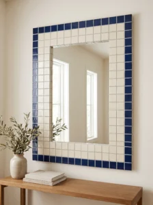
A plain field with a contrasting border is the easiest way to make a mosaic look finished. The border does the framing, so the middle can stay simple.
Use one or two rows of a bold color around a calmer center. Navy around soft gray, deep green around cream, or copper-toned glass around white all give a clear edge. The border should look intentional, not like leftover tile.
This works well on mirrors, tabletops, shelf backs, and wall panels. For a mirror frame, a double row of one-inch tiles around a standard rectangular mirror gives a neat result without any complicated geometry.
Lay the border first, then fill in the field. That keeps the outer edge straight and lets you adjust the middle if the count is off by a tile or two.
A common slip is a border that matches the field too closely. If you squint and can’t see the frame, push the contrast further.
Because the eye reads the frame first, small flaws inside the field tend to disappear. That makes this a forgiving choice while your cutting and spacing are still improving.
6. Center Medallion on a Quiet Background
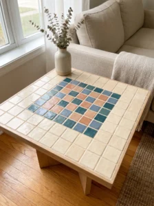
A small cluster of bright tiles in the middle of a calm field gives a mosaic a focal point without demanding much skill. Think of it as one punctuation mark in a plain sentence.
A three-by-three or five-by-five block works best. Use two or three accent colors in the cluster, set against a single neutral like cream, light gray, or pale sand. Odd numbers matter here, since they give you a true center tile and keep everything symmetrical.
This pattern shines on tabletops, entry floor insets, and wall plaques. It also suits the back of a shower niche, where a small accent pulls the eye inward.
Plan the cluster on graph paper first, one box per tile, and color it in with pencils. Then copy the grid onto the base in pencil.
Keep the accent colors within the same temperature range. Warm reds and oranges together, or cool blues and greens, feel cohesive. A random mix of warm and cool tends to look scattered.
On a side table, the medallion gives you something to look at without needing extra decor on top.
7. Horizontal Stripes
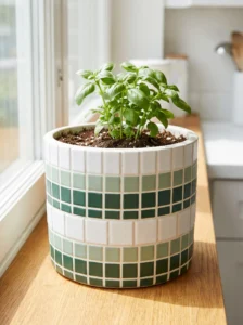
Stripes are mosaic on easy mode. Every row is a single color, so there’s no pattern to track beyond choosing the order.
Alternate two colors for a crisp look, or use three for a bit of rhythm: white, sage, white, deep green. Rows of equal width keep things tidy. A double-wide band every few rows adds interest wherever you want some emphasis.
Stripes work on shower walls, kitchen backsplashes, planters, and the sides of garden pots. In a narrow bathroom, horizontal stripes visually widen the wall, while vertical ones add height.
Mark the row lines on the base with a pencil and a level before setting any tile. Spacing can wander on long runs, and a guide line catches it early.
Avoid very thin contrast, like two near-identical grays, because grout will swallow the difference. Matte next to glossy in the same color can work too and gives a subtle stripe.
Beginners often finish a striped planter first, since it’s small, forgiving, and sits right where people see it every day. A first success like that builds confidence for bigger surfaces.
8. Pixel Heart or Simple Icon

A pixel heart looks sweet and clever at the same time, and it’s easier than it appears because every tile is a pixel. Plan it on graph paper and the pattern builds itself.
A nine-by-nine grid holds a recognizable heart with room to spare. Fill the heart with one color, usually red, coral, or blush, and leave the background a calm neutral. Other simple shapes work too: a star, a house, a leaf, or a single letter.
Ideal spots include wall art, trivets, coasters, and the back of a bookshelf. Pick a one-inch tile so the shape reads from across the room.
Count carefully. Mark the grid on the base, place the heart tiles first, then fill in the background. Dry-fit and photograph the shape before any adhesive goes on.
The mistake to watch for is a shape that sits off-center. Measure from both edges, not just one.
A small pixel piece also makes a thoughtful gift, since the design takes an evening and the result feels personal.
9. Confetti Scatter
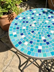
Confetti mosaic rewards a relaxed attitude. Instead of following a plan, you mix tiles from one color family and place them at random, so mistakes simply become part of the look.
It suits stepping stones, tabletops, kids’ craft projects, and garden planters. Because nothing has to line up, it’s also a handy way to use up leftover tile.
Choose a palette of four to six colors that sit well together, such as blues, aqua, and white, or warm earthy tones. Shake them in a bag, place them as they come, and then fix any clusters where the same color lands side by side.
Balance is the key. Spread the darkest and brightest tiles evenly so no corner feels heavier than the rest, and step back from the piece every few rows.
Random still needs a little control. Don’t let one color take over.
Grout in a mid-tone, like warm gray, keeps the mix from looking busy.
On a patio table, this style hides crumbs, drips, and small chips far better than a tidy pattern does, which is a quiet reason it holds up so well in everyday use.
10. Concentric Squares
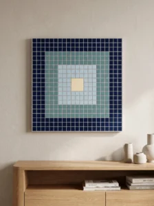
Nested squares create a target-like pattern with a strong sense of order. Each ring is a single color, working inward from the border to one tile at the center.
Start with an odd-numbered grid, such as seven by seven, so the middle is a single tile. Three or four colors is plenty. A dark outer ring, a mid-tone second ring, a light third ring, and a bold center tile make a classic combination.
Coasters, tabletops, wall plaques, and entry floor insets all suit this pattern. On a larger surface, more rings add a hypnotic effect, but keep the ring count manageable for a first try.
Sketch it on graph paper, then work from the center outward. This keeps each ring even and stops the pattern from skewing toward one side.
Watch out for rings that are too similar in color. If two neighboring rings blur together, the nested effect disappears.
In an entry, a concentric floor inset acts like a built-in rug. It marks the spot where people drop bags and kick off shoes, and it wipes clean in seconds.
11. Basketweave With Paired Squares
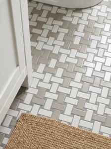
Basketweave groups square tiles in pairs, then flips each pair a quarter turn so the direction alternates. The result looks woven and quietly classic.
Two tiles side by side form a small rectangle. Set one pair horizontally, the next vertically, and keep alternating across and down. Same-colored tiles with contrasting grout make the weave visible, while two colors give a bolder, graphic feel.
This suits bathroom floors, kitchen backsplashes, and entry mats. One-inch tiles are comfortable to handle, and the pattern holds up well at that size.
Keep every pair the same size. A pair that’s slightly off throws off the rows that follow. Lightly chalk the base with a grid of pair-sized blocks to track the direction.
The usual slip is losing count of which pair comes next. Work one row at a time and check it before moving on.
Because the pattern carries a lot of visual texture, it also hides dust and water spots on a bathroom floor between cleanings, which is a nice side benefit for busy households.
12. Offset Rows for a Brick-Style Look
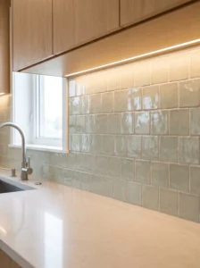
Shifting each row half a tile creates a brick-style look from plain squares. The staggered joints soften the stiffness of a pure grid and make a wall feel more relaxed.
This suits kitchen backsplashes and accent walls. Soft neutrals, or a single color with slight shade variation from tile to tile, keep the effect subtle. Glossy glass squares in pale green or gray look especially good under cabinet lighting.
The edges need half tiles, which means a little cutting. A tile nipper or a wet saw handles it, or you can hide the cut ends behind a frame or trim.
Mark vertical guide lines at half-tile intervals so the offset stays consistent. Without them, rows creep out of step.
Keep grout lines even. With offset layouts, a slightly wider joint stands out immediately.
Staggered joints also hide small alignment errors better than a straight grid, where every misaligned joint lines up and shows. That makes this layout friendly for beginners who are still developing a steady hand.
13. Four-Quadrant Color Blocking
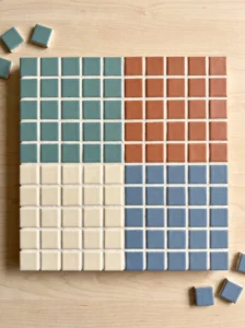
Divide a square into four equal quadrants, fill each with its own color, and you get a bold, modern block. It’s basic geometry with a lot of visual punch.
Use an even number of tiles per side, such as six by six, so each quadrant is three by three. Two colors placed diagonally look like a flag, while four different colors feel playful. Keep the palette limited so the quadrants read as a deliberate design.
Coasters, trivets, and small wall panels all suit this pattern. It also works for a tabletop, where the cross line in the center adds structure.
Set the center cross first, then fill each quadrant. Check that the quadrants are truly equal before the adhesive sets, because unequal blocks are obvious at a glance.
Neat, narrow grout lines keep the color blocks looking clean. Wide gaps weaken the effect.
A set of four coasters, each with the colors arranged differently, looks like a deliberate collection when stacked together. It’s a simple way to make a handmade gift feel finished.
14. Stepped Zigzag
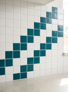
A stepped zigzag climbs like a staircase across a surface, creating movement using only straight edges. Each row shifts by one tile from the last.
Use two colors, one for the zigzag and one for the background. A bold stripe of teal against white, or terracotta on cream, makes the movement easy to read. Wider zigzags, with two or three tiles per step, feel calmer than tight ones.
This pattern fits backsplash strips, planter bands, and borders along a longer wall. It’s especially handy when you want a focal line but don’t need a full-surface mosaic.
Plan the steps on graph paper, then mark the base with pencil. Keep the step size consistent from start to finish. A single odd step breaks the rhythm.
The mistake to avoid is reversing the direction halfway without planning it. If you want a peak, mark it before you start.
A zigzag band across a plain kitchen wall creates a horizon line that organizes the whole room. The eye follows it, and everything else seems to settle into place.
15. Monochrome Mix of Textures
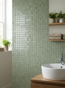
One color, several finishes: this is the quiet pattern. Glossy, matte, and crackled square tiles in the same shade create depth without any color risk.
Choose a color that suits the room, such as white, sage, navy, or soft clay. Arrange the finishes in a loose grid, either scattered or in a loose rhythm, so the texture changes from tile to tile. The result looks layered and a little handmade.
Bathrooms and kitchens suit this well, as do small accent walls. In a bathroom, the glossy tiles catch light while the matte ones soften it, which feels spa-like.
Keep the grout close to the tile color so the finishes take center stage. Contrast grout would pull the eye back to the grid.
Avoid finishes that are too similar. If you can’t see the difference from a few feet away, the effect is lost.
In daylight, the wall seems to shift as the sun moves. The glossy tiles flash and fade, which gives a plain color a surprisingly lively presence.
Square Mosaic Patterns at a Glance
| Type | Best Use | Material | Style/Vibe | Difficulty Level |
|---|---|---|---|---|
| Classic checkerboard | Coasters, trivets, small tables | Ceramic or glass squares | Timeless, graphic | Easy |
| Straight grid | Backsplashes, shower niches | Mesh-mounted glass tile | Clean, modern | Easy |
| Ombré rows | Bathrooms, kitchen walls | Graduated glass tile | Soft, calming | Easy |
| Diamond layout | Tabletops, floor insets | Ceramic squares | Dynamic, classic | Medium |
| Pixel heart | Wall art, gifts | Ceramic or glass squares | Playful, handmade | Easy |
| Basketweave | Bathroom floors, entry mats | Ceramic or porcelain squares | Woven, traditional | Medium |
How to Choose Tiles and Supplies for Your First Mosaic
Start with scale. One-inch squares are the friendliest size for a beginner, large enough to handle comfortably and small enough to make a pattern readable on a coaster or trivet. Three-quarter-inch tiles suit finer detail, like a pixel heart, while two-inch squares cover a backsplash or tabletop faster. A good rule is to match tile size to the surface: tiny tiles on a big wall mean endless setting, and big tiles on a coaster leave no room for pattern.
Material comes next. Ceramic and porcelain are affordable, sturdy, and easy to find, and they suit floors, counters, and outdoor pieces. Glass tile is bright and reflective, which looks lovely on walls, though the edges can be sharper and translucent glass needs white adhesive so the glue doesn’t show through. Natural stone adds texture but is heavier and usually needs sealing. Tiles mounted on mesh sheets save time and keep spacing even, so they are worth the small premium for a first backsplash.
Durability depends on where the piece will live. Floors need tile rated for foot traffic. Wet areas need a cement backer board and waterproof adhesive, not craft glue. Outdoor projects need frost-resistant tile and exterior-grade materials, or winter will crack them.
Maintenance is mostly about grout. Cement-based grout benefits from a sealer once it cures, while epoxy grout resists stains without sealing but is harder to work with. Wipe surfaces with a mild, pH-neutral cleaner and skip harsh scrubbing.
Budget gets tricky because tiles are only part of the cost. Adhesive, grout, spacers, nippers, a sponge, safety glasses, and sealer add up. Order roughly ten to fifteen percent more tile than your layout needs to cover cuts and slips. Spend on adhesive and the surface underneath, and save on decorative extras.
The most common regrets are easy to avoid. Tiles from different batches can vary in color, so buy everything for one project at once. Skipping a sample means discovering the shade looks different in your light. Mixing sanded and unsanded grout up is common too. Dry-fit the whole pattern first, wear eye protection when cutting, and let everything cure fully before use.
Final Thoughts on Square Mosaic Patterns
What makes square tile so useful for beginners is that it takes most of the guesswork out. The shape is predictable, the lines are straight, and the pattern does the creative work. A checkerboard, a row of stripes, and a simple border can each look polished with very little skill, as long as the spacing is steady and the colors have real contrast.
If you’re deciding where to begin, pick a small surface and a simple pattern. A coaster in checkerboard or a trivet in four-quadrant blocks teaches you the whole process in an afternoon: planning, setting, grouting, and cleaning. Once that feels comfortable, move up to a backsplash strip or a framed mirror, where the same habits apply at a larger scale.
Buy a little extra tile, plan on graph paper, and dry-fit before you glue. Those three habits prevent most of the frustrations beginners run into. Patience during grouting matters just as much, since rushing is how tiles get smeared and lines get messy.
It also helps to remember that handmade pieces rarely look perfect, and that’s part of the appeal. A slightly uneven joint disappears from a few feet away, while the color and pattern are what people notice.
Choose one pattern from this list, gather your tiles, and set aside a weekend afternoon. The first finished piece tends to make the next one much easier to start.
Frequently Asked Questions
What is the easiest mosaic pattern for a complete beginner?
A checkerboard or a set of horizontal stripes is the easiest place to start. Both use straight rows, simple color choices, and no cutting. A coaster-sized base keeps the project short, so you can learn spacing and grouting without a big commitment.
What size tiles are best for beginners?
One-inch square tiles are the most comfortable size for most beginner projects. They are easy to hold, easy to space, and large enough to show a pattern clearly. Smaller tiles suit detailed designs but take longer to set.
Do I need special tools to start?
Not many. Tile nippers, a notched trowel or small spreader, spacers, a grout float, a sponge, and safety glasses cover most basics. A wet saw helps with larger projects but isn’t needed for coasters or small panels made with uncut tiles.
Can I make a mosaic for outdoor use?
Yes, with the right materials. Use frost-resistant ceramic or porcelain tile, exterior-grade adhesive, and a stable base such as cement board. Seal the grout and keep standing water from collecting on the surface, or freezing weather can damage it.
How long does a small mosaic project take?
A coaster or trivet usually takes an afternoon to lay out and set, plus a day for adhesive to cure before grouting. Larger pieces, like a tabletop or backsplash section, take longer because of layout, cutting, and cure times between steps.
Should I use sanded or unsanded grout?
Unsanded grout suits narrow joints under about an eighth of an inch, while sanded grout is better for wider gaps. Glass tiles are often paired with unsanded grout to avoid scratching, though you should check the tile maker’s guidance.
How do I keep a mosaic clean?
Wipe it with a damp cloth and a mild cleaner. Sealing cement-based grout helps it resist stains and moisture. Avoid abrasive pads on glass or glossy tile, since they can leave scratches that dull the finish.
What are the most common beginner mistakes?
Skipping the dry fit, starting from a corner instead of the center, using uneven spacing, and choosing colors that are too close together. Buying tile from different batches can cause color mismatches too. Slowing down at the planning stage prevents most of these.