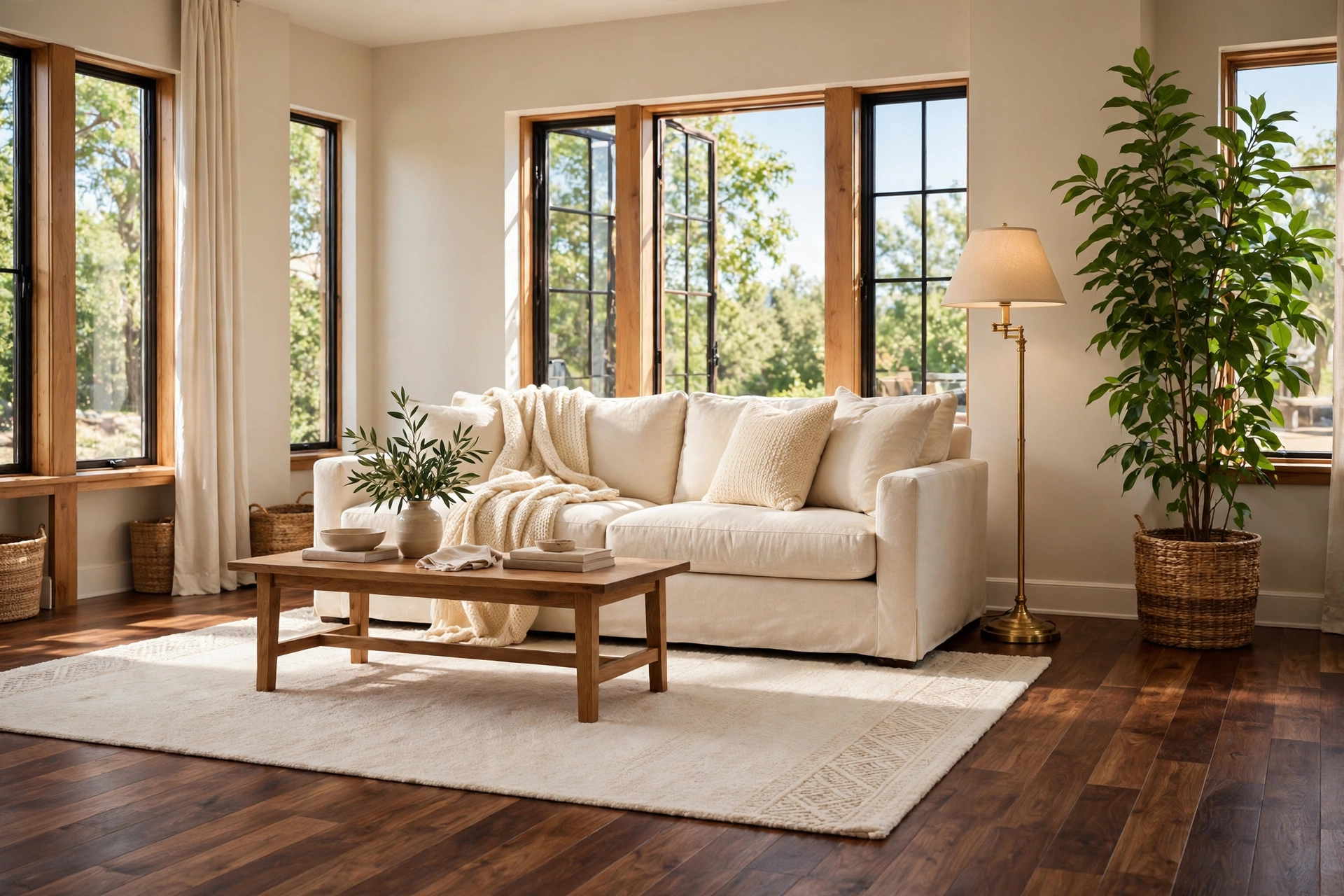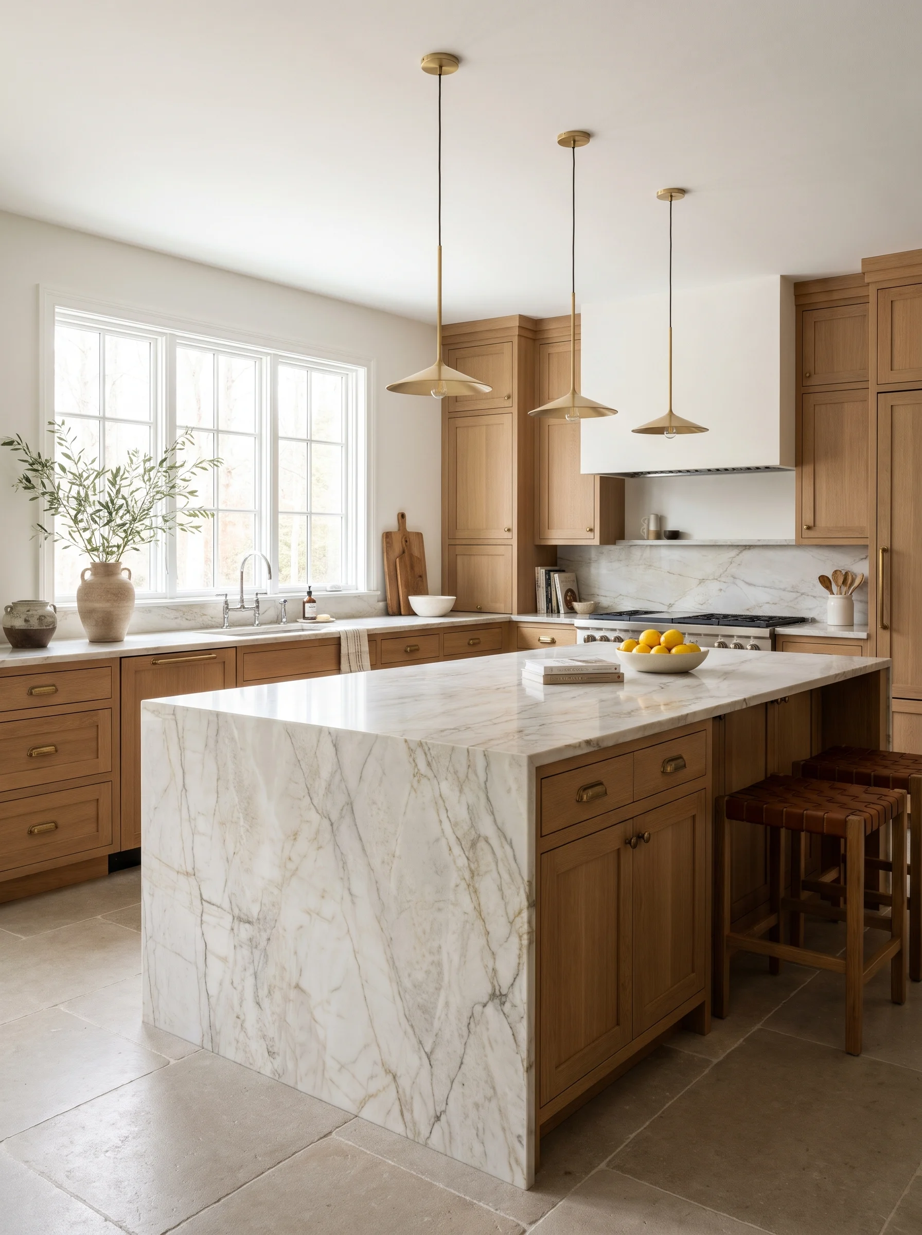
Countertop shopping has a way of ending in a warehouse, staring at a slab under fluorescent lights, while a salesperson says “that one’s very popular.” You nod. You take a photo. Then you get home, look at the photo next to your cabinet sample, and realize the two have nothing to say to each other.
Quartzite makes the decision harder, not easier. It’s a natural stone, so no two slabs match, and the same name can cover very different looks depending on the quarry and the batch. A “white” one might lean gray, cream, or faintly blue. Another might look calm from across the room and wild up close. Plenty of people also mix it up with quartz, which is engineered, and the two behave quite differently once they’re in your kitchen.
Here’s the useful part. Quartzite colors fall into fairly clear families, and each family suits certain cabinets, floors, and light levels. Knowing which family you’re drawn to narrows the field fast, before you spend a weekend driving between stone yards.
Below are 11 colors worth considering, with notes on which cabinets they pair with, how to read the veining, and the trade-offs people tend to find out too late. After that you’ll find a comparison table, a buying guide, and answers to common questions.
1. Soft White With Gray Veining
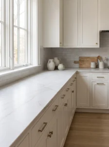
White quartzite is the one most people picture first, and it earns its popularity. Slabs sold as Super White or Mont Blanc usually sit somewhere between bright white and pale gray, with soft veins that read as marble without the same fragility.
It works best in kitchens that need brightening: north-facing rooms, galley layouts, anywhere the natural light is thin. Pair it with painted cabinets in warm white, soft green, or deep navy, and let the veining do the decorating. Keep the backsplash simple, since a busy tile next to active veining gets tiring fast.
The mistake is buying from a small sample. White slabs vary a lot in how much gray they carry, and some have bold streaks that look nothing like the chip on your table. Go to the yard and look at the full slab, ideally the one you’ll actually receive.
Everyday life with it is easier than with marble. A splash of lemon juice or wine is less likely to leave a dull spot, though you should still seal it and wipe spills promptly.
2. Warm Cream Like Taj Mahal
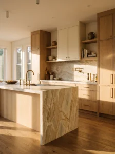
Taj Mahal is the name that kept coming up in kitchen showrooms for years, and the appeal is easy to see. It’s a creamy, sandy neutral with faint beige and gold movement, softer than stark white and warmer than gray.
Use it where the room already leans warm: oak floors, brass fixtures, wood open shelves, cabinets in cream or putty. It’s forgiving in kitchens that get strong afternoon sun, because it doesn’t turn glaring. A honed finish suits it, giving a velvety look that hides smudges better than a high polish.
Avoid pairing it with cool, blue-based whites on the walls. The mix looks accidental, and the stone takes on a yellowish cast. Test paint samples beside a piece of the slab, not beside a photo.
One small thing people notice after a few months: this tone is kind to everyday mess. Crumbs, water spots, and fingerprints blend into the warm background, so the counters look tidy longer than they would in pure white or black.
3. Cool Gray Quartzite
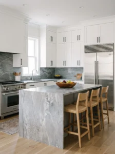
Gray gets a bad reputation for being a trend, but a good gray quartzite feels more like a quiet stone than a color choice. Look for slabs with silvery, cloud-like movement rather than flat, uniform gray, which can look like laminate from a distance.
It’s a natural partner for white or black cabinets and for stainless steel appliances, and it suits modern or transitional kitchens where the look is cool and tidy. Brushed nickel or matte black hardware keeps the palette consistent. Add warmth with wood stools or a natural fiber runner so the room doesn’t turn sterile.
Beware of floors with a strong yellow or red undertone. Cool gray stone sitting next to orange-toned wood can make both look off. Hold the sample against the floor in real light before committing.
In practice, gray is the easiest shade for daily upkeep. It hides small scratches and etch marks better than white, and it doesn’t show water rings on a honed surface, which makes it handy in busy family kitchens.
4. Greige and Taupe Blends
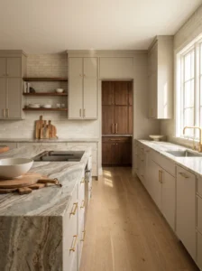
Not warm, not cool, somewhere in between: that’s the appeal of a greige or taupe quartzite. Slabs in this family, including some sold as Fantasy Brown, mix gray, tan, and soft brown in swirling patterns that feel earthy and relaxed.
It’s a smart choice when you have mixed finishes in the room and need a stone that bridges them. Beige-leaning cabinets, walnut accents, and brushed brass all sit comfortably against it. Because there’s so much variation, it also disguises seams better than a plain stone.
Look closely at the movement. Strong, dramatic waves can overwhelm a small kitchen, so in compact rooms pick a slab with subtler patterning. In a larger space, let it stand out and keep the cabinets quiet.
A mistake to avoid is picking this tone from a thumbnail on a website. Photos exaggerate or flatten the brown, and you may end up with something muddier than expected.
Once it’s in, you’ll appreciate how forgiving it is. The mix of tones works like camouflage for crumbs and coffee drips, and it holds up through years of redecorating without looking dated.
5. Pale Sea-Green
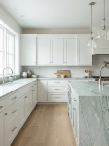
Soft green-gray quartzite, like the slabs sold as Sea Pearl, has a watery calm that’s hard to get from paint. The color is subtle, closer to seaglass than mint, with pearly highlights that shift through the day.
It suits coastal homes, but it also suits anyone who wants softness without committing to a bold color. White or pale wood cabinets let it breathe, and light oak floors enhance the green-gray tone. Matte brass or brushed nickel hardware both work.
Be careful about lighting. Strongly warm bulbs can turn the stone muddy, while very cool daylight bulbs make it look sterile. A neutral white around 3000K to 3500K tends to show it at its best. Check it under your own kitchen lights before approving the slab.
The practical upside is that it’s easy on the eye, which matters in a room you walk through all day. People often find a pale green counter makes a kitchen feel quieter and cleaner, even when it’s busy, because it doesn’t compete with everything else.
6. Blue-Gray With Brown Streaks
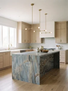
Blue Roma and similar slabs bring blue-gray tones threaded with taupe and brown, a mix that sits between serious and playful. From a distance it looks like an overcast sky, up close like layered rock.
It works well on an island, where a bold stone can be the focal point while perimeter counters stay simple. Pair it with white, cream, or pale wood cabinets, and bring the blue forward with a matching accent like a rug or pendant shade. Choose a honed or leathered finish to calm the movement.
Avoid pairing it with more than two or three other strong colors. With so much going on in the stone itself, the kitchen quickly feels busy. Keep the backsplash plain, either the same stone or a simple white tile.
The surprise tends to come after installation. Because the pattern is so varied, it hides wear beautifully, and most people stop noticing small marks within a few weeks. It’s a nice option for a household that cooks hard and doesn’t want to baby the counters.
7. Deep Blue
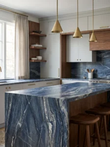
Rich blue quartzite, such as Azul Macaubas, is among the most striking natural stones you can put in a kitchen. The color runs from midnight blue to a brighter, almost electric tone, with white and gray veins that look like rivers on a map.
This is a statement stone, so use it deliberately. A small island, a bar top, or a short run of counter gives you the impact without overpowering the room. White, pale gray, or warm wood cabinets set it off, and brass or polished nickel hardware pairs well.
Cost is the main thing to plan for. Rare colors tend to command higher prices, and fabrication wastes less than you’d expect only if the layout is planned carefully. Ask the fabricator to map the cuts on the slab so the pattern flows naturally across seams.
Keep the rest of the palette calm. Neutral walls and simple lighting let the stone do the talking. People who choose it usually say the same thing: the counter ends up being what guests walk over to touch, and it stays a conversation piece for years.
8. Golden Honey Tones
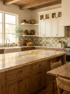
Quartzite with golden or honey movement, like Dolce Vita, brings warmth into rooms that feel cold or flat. The base is often cream or pale beige, laced with amber, caramel, and sometimes soft gray.
It suits kitchens with warm woods, terracotta floors, or Mediterranean-style details, and it’s lovely beside cabinets in olive, sage, or creamy white. Antique brass and bronze hardware pick up the gold in the veining. Honed finishes give it an aged, almost stone-washed feel.
The risk is clashing with cool elements. Chrome fixtures, stark white cabinets, and blue-toned lighting can make golden veins look dirty rather than rich. If your kitchen is cool-toned already, choose a different family.
Natural light changes this stone more than most. In morning sun it glows, and under evening lamps it softens into something almost candlelit. That shifting quality is why people love it, so view the slab at different times of day before choosing. It brings a lived-in warmth that a flat beige never quite manages.
9. Deep Forest Green
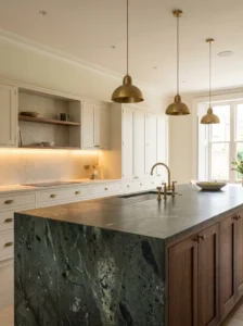
Dark green quartzite is rare, and that’s part of the draw. Slabs like Verde Peludo have a mossy, mineral depth that feels more like a landscape than a countertop, with flecks of black, gray, and pale green.
It suits traditional, cottage, or moody modern kitchens, where it can pair with dark wood, cream cabinets, or even a paler green. Aged brass hardware and warm lighting give it a library-like richness. Use it for a full run of counters in a larger room, or just on an island in a smaller one.
Dark stones show dust and water spots, so a honed or leathered finish is more forgiving than polished. Keep a soft cloth handy. Also check availability early, since rarer colors can take longer to source and cost more to ship.
Mistakes usually involve lighting. In a dim kitchen, deep green can swallow the room. Pair it with good under-cabinet lights and pale walls, and it becomes the anchor of the space rather than a void.
10. Charcoal and Near-Black
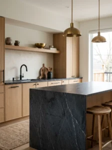
True black is uncommon in natural quartzite, but charcoal and smoky dark gray slabs exist and make a dramatic counter. Expect fine white or silver veining and a deep, matte-leaning look.
It suits modern kitchens, industrial lofts, and spaces with lots of natural light to balance the darkness. White or light wood cabinets create a crisp contrast, and black fixtures can be blended or deliberately set against warm brass. Leave the backsplash light or let it match the stone for a seamless effect.
The main thing to understand is that dark stone shows everything: dust, fingerprints, water rings. A honed or leathered finish is far kinder than polished. Keep sealing up to date, and use a pH-neutral cleaner so the surface doesn’t dull.
Ask for the slab, not a sample. Dark stones often vary more than people expect, with patches that look brown or blue in certain light. After living with one, people tend to say the kitchen feels grounded and deliberate, as long as a bit of wood or brass keeps it from feeling heavy.
11. Blush and Soft Rose Tones
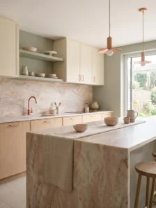
Pale pink and rose-tinted quartzite sounds risky, but in practice it often reads as a warm neutral. The color usually shows up as a soft peach or dusty rose cloud inside a cream or white base, never candy pink.
It suits kitchens with warm metals, natural wood, and plaster-style walls. Cabinets in cream, sage, or a muted clay shade sit well with it, and copper or brushed brass hardware picks up the glow. In a bright room it feels fresh and gentle, while in a darker one it adds a welcome softness.
The biggest mistake is buying it unseen. Pink can swing from barely there to rather obvious depending on the slab, so view it in person and bring a sample of your cabinet color. Keep other pinks out of the room, and let the stone be the single note of rose.
People who choose this tone often find it flatters everything around it, from wood to plants to skin tones in the evening light. It also makes a good compromise for anyone who finds white too stark and gray too cold.
Quick Comparison: Which Quartzite Color Fits Your Kitchen?
| Type | Best Use | Material | Style/Vibe | Difficulty Level |
|---|---|---|---|---|
| Soft white with gray veining | Dark or small kitchens needing light | Natural quartzite, polished or honed | Clean, classic | Easy |
| Warm cream (Taj Mahal style) | Warm woods and brass fixtures | Natural quartzite, honed finish | Soft, welcoming | Easy |
| Cool gray | Modern kitchens with stainless appliances | Natural quartzite, polished or leathered | Sleek, calm | Easy |
| Blue-gray with brown streaks | Islands and focal points | Natural quartzite, honed or leathered | Earthy, expressive | Moderate |
| Deep green | Moody, traditional or cottage kitchens | Natural quartzite, honed finish | Rich, dramatic | Advanced |
| Charcoal / near-black | Contemporary kitchens with plenty of light | Natural quartzite, leathered finish | Bold, grounded | Moderate |
How to Choose the Right Quartzite for Your Remodel
Start by deciding how much drama you want. Quiet whites, creams, and grays suit most kitchens and resell easily. Blues, greens, and blush tones are better for owners who plan to stay and want something personal. Choose one stone as the star and keep everything else supportive.
See the full slab before you buy. Natural stone varies from one slab to the next, and a sample can’t show you the full pattern. Visit the yard, ask for the exact slab, and photograph it in daylight. If a project needs more than one slab, ask to see them side by side so the veining matches at seams.
Check the quartzite is real. Some stones sold under the name are actually marble or soft quartzite that etches. Ask the supplier about the stone’s origin and hardness, and test a small offcut with a drop of lemon juice or vinegar if they’ll allow it. A true, hard quartzite should resist etching.
For size, plan the layout so seams fall in sensible places, away from the sink and cooktop. Thickness is usually 2 or 3 centimeters, and a thicker edge adds weight and cost.
Budget realistically. Rare colors, thicker slabs, and complex edges raise the total, and fabrication and installation can be a big share of the price. Get at least three quotes and compare what’s included.
Finish matters for maintenance. Polished shows etching and fingerprints less in light colors but more in dark ones, while honed and leathered hide wear and feel softer. Seal as the supplier recommends, and use pH-neutral cleaners.
The usual regrets are choosing from a photo, ignoring undertones, skimping on sealing, and picking a color that fights the flooring. Take samples home, look at them morning and night, and wait a few days before signing.
Making the Final Call
A good quartzite choice comes down to three things: the color family that suits your light and cabinets, a slab you’ve actually seen in person, and a finish that matches how you live. Soft whites, creams, and grays are the safe, flexible picks. Blues, greens, and blush tones add character if you’re willing to plan the rest of the room around them.
If your kitchen is small or dim, lean toward lighter stones with gentle movement. If you have plenty of light and like a bolder look, a dark or colored slab on an island gives you the drama without overwhelming the whole room. Mixed finishes and warm metals tie most of these colors together without much effort.
Before you commit, bring home a cabinet door, a flooring sample, and a paint chip, then set them next to the stone sample at different times of day. Ask how the stone is sealed, what cleaners to use, and what the supplier’s policy is if a slab shows a flaw.
Take your time. A countertop is a decision you’ll live with every morning, and the right slab tends to feel less like a trend and more like a part of the house. When you can imagine making coffee next to it for the next fifteen years, you’ve probably found the one.
FAQs
Is quartzite better than granite for kitchen counters?
Both are durable natural stones. Quartzite is often harder and tends to resist scratching well, while granite is usually easier to find and a bit more affordable. Pick based on the look you want, since both need sealing.
Do quartzite countertops stain or etch?
A true quartzite resists etching, but it can still stain if oils, wine, or coffee sit on it. Sealing helps a lot, and wiping up spills quickly does the rest. Some stones sold as quartzite are softer and can etch, so ask for proof.
How often should quartzite be sealed?
It depends on the stone and finish, but once a year is a common starting point. Test by dropping water on the surface. If it darkens and soaks in, it’s time to reseal.
Is quartzite the same as quartz?
No. Quartzite is natural stone cut from a quarry, while quartz is engineered from crushed stone and resin. They look similar but behave differently in terms of heat tolerance, patterns, and care.
How much does quartzite cost?
Prices vary widely by color, rarity, thickness, and installer, and rare blues and greens tend to cost more. Get several local quotes with the same layout so you can compare fairly.
Can I put hot pans on quartzite?
It handles heat better than many surfaces, but sudden temperature changes can still cause stress. Use a trivet as a habit, especially with very hot cookware straight from the burner.
What cleaner should I use on quartzite?
Mild dish soap and warm water work for daily cleaning, and pH-neutral stone cleaners are fine for deeper cleaning. Avoid vinegar, bleach, and harsh abrasives, which can dull the finish or break down the sealer.
Which finish is best for a busy kitchen?
Honed and leathered finishes hide fingerprints, water spots, and light scratches better than polished. Polished is easier to wipe but shows marks more in darker stones.