Choosing a living room paint color sounds simple until you actually stand in front of hundreds of paint swatches wondering why every beige suddenly looks pink, gray, or strangely purple. Most people don’t struggle because they lack taste — they struggle because living room color affects everything. It changes how big the room feels, how natural light works, how cozy evenings feel, and even whether your furniture looks expensive or tired.
The biggest mistake homeowners make is choosing a color based only on trends. A color that looks stunning in a perfectly staged showroom may feel cold, dark, or overwhelming in a real home with everyday lighting, pets, kids, and mismatched furniture. Paint is not just decoration; it shapes the mood of the entire house.
The good news is that you do not need an interior designer to make a smart decision. Once you understand how undertones, lighting, room size, and furniture work together, choosing the right living room color becomes much easier. Sometimes the best color is not the boldest one — it is the one that quietly makes the room feel balanced and comfortable every day.
In this guide, you’ll learn practical, realistic living room paint ideas that actually work in everyday homes. From warm neutrals to dramatic dark shades, each idea explains why the color works, where to use it, and how to avoid common mistakes that make rooms feel awkward or unfinished.
1. Warm White Creates a Clean but Comfortable Living Room
A warm white living room almost never goes out of style because it feels fresh without looking sterile. Unlike cool white shades that can feel harsh or hospital-like, warm whites have creamy or soft beige undertones that make a space feel inviting.
This color works especially well in small or medium-sized living rooms that need brightness. It reflects natural light beautifully and helps older homes feel more open. If your living room has limited windows, warm white can make the space feel less boxed in.
Pair warm white walls with wood furniture, linen curtains, and textured rugs to avoid a flat appearance. Soft black accents like picture frames or lamps also help create contrast. One common mistake is using bright pure white with warm-toned furniture — it often clashes and makes the room feel disconnected.
In daily life, warm white is practical because it adapts easily to seasonal decor changes. Your room can feel airy in summer and cozy in winter simply by changing pillows or throws instead of repainting the walls.
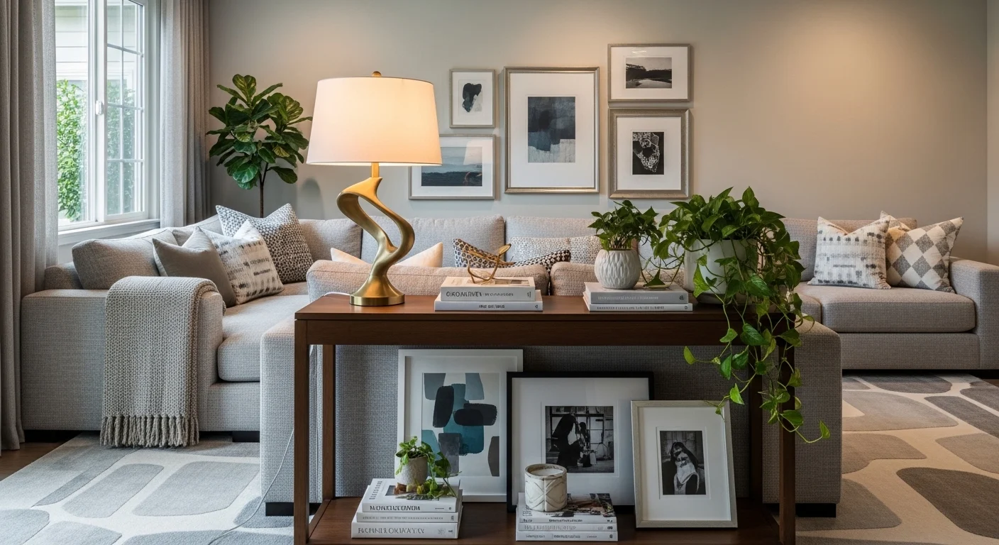
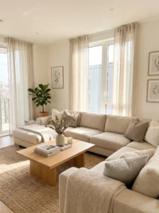
2. Soft Beige Makes a Living Room Feel Relaxed
Beige sometimes gets unfairly labeled as boring, but the right beige creates a calm, layered space that feels timeless. The reason it works so well is because it adds warmth without overpowering the room.
Soft beige is ideal for family living rooms, apartments, and open-concept homes where you want flexibility. It pairs effortlessly with wood, leather, black accents, greenery, and almost every furniture style.
The key is choosing the correct undertone. Some beige paints lean yellow, while others lean gray or pink. Testing samples on multiple walls is essential because natural light changes the appearance throughout the day.
Use textured fabrics like boucle, woven baskets, or chunky knit throws to keep the room visually interesting. Beige rooms can look flat if every surface is the exact same tone. Adding contrast through darker furniture or layered textures solves that issue.
In everyday use, beige is forgiving. Dust, fingerprints, and small wall imperfections are less noticeable compared to bright white walls. That alone makes it a practical option for busy households.
3. Greige Gives You the Best of Gray and Beige
Greige became popular for a reason: it solves the problem many homeowners face with gray feeling too cold and beige feeling too warm. It sits right in the middle, creating balance.
This shade works beautifully in modern homes, transitional interiors, and living rooms connected to kitchens. It complements stainless steel appliances, wood flooring, and neutral furniture without fighting for attention.
Greige performs best in rooms with moderate natural light. In darker spaces, choose a lighter version so the room does not feel muddy. Pair it with black hardware, cream furniture, or warm wood tones for a sophisticated look.
A common mistake is combining cool greige with overly warm furniture. Always compare paint samples directly beside your sofa and flooring before committing.
The biggest advantage of greige is versatility. It creates a polished background that lets artwork, lighting, or statement furniture stand out naturally instead of competing with the wall color.
4. Light Gray Works Best in Modern Spaces
Light gray still works beautifully when used correctly. The problem is not gray itself — it is choosing the wrong undertone. Cool grays can feel icy in dim spaces, while warmer grays feel softer and more welcoming.
This color is ideal for contemporary homes, minimalist interiors, and urban apartments. It pairs especially well with black accents, marble, metal finishes, and sleek furniture.
If you choose gray, pay attention to lighting. North-facing rooms often make gray look colder, so warmer gray shades are safer. Layering warm textures like wood, soft fabrics, and warm lighting helps prevent the room from feeling lifeless.
Avoid using too much gray everywhere. Gray walls with gray furniture and gray flooring often create a dull atmosphere. Contrast is important.
In real-life use, light gray is popular because it feels clean and polished without demanding attention. It also provides a neutral backdrop for seasonal decorating.
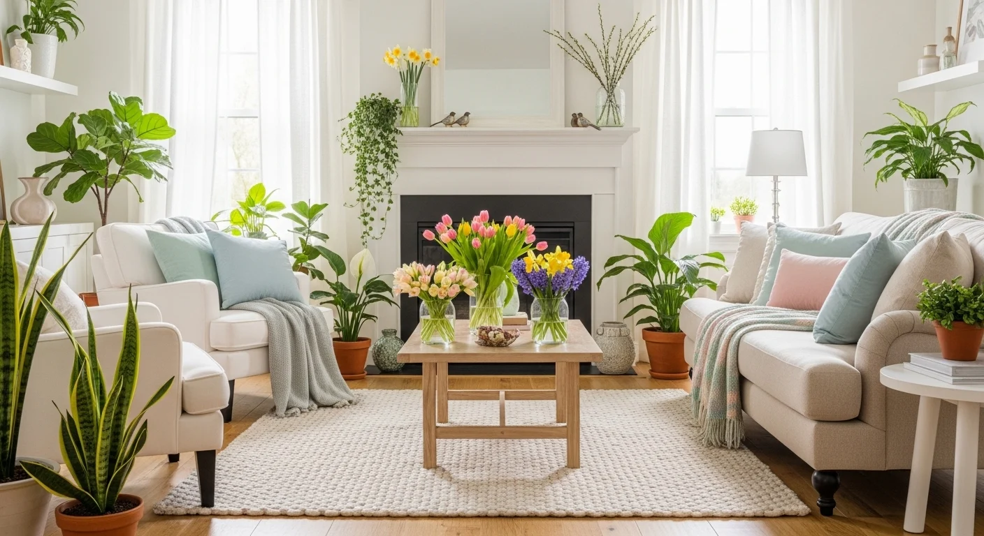
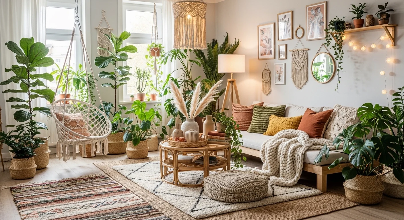
5. Sage Green Brings a Calm Natural Feeling
Sage green has become one of the most loved living room colors because it feels peaceful without being boring. It connects indoor spaces with nature and creates a relaxed atmosphere.
This shade works well in living rooms with lots of natural light, plants, and wooden furniture. It looks especially beautiful with cream sofas, oak furniture, brass accents, and textured fabrics.
The reason sage green works is psychological as much as visual. Green tones naturally feel calming and balanced, which makes the living room more comfortable for everyday use.
Avoid overly bright or saturated greens unless you want a bold statement room. Muted sage shades are easier to live with long-term.
One practical advantage is that sage hides dust and wall marks better than stark white. It also works across different design styles, from farmhouse to modern organic interiors.
6. Navy Blue Adds Depth and Sophistication
Navy blue can make a living room feel dramatic in the best way possible. While many people fear dark colors, navy actually creates warmth and depth when balanced correctly.
This color works best in medium to large living rooms or spaces with strong natural lighting. It pairs beautifully with brass lighting, white trim, leather furniture, and warm wood finishes.
The trick is balance. If every element is dark, the room may feel heavy. Adding lighter rugs, curtains, or sofas prevents that problem.
Navy is especially effective for accent walls behind fireplaces or TV units. It adds personality without overwhelming the entire room.
In daily life, navy feels cozy during evenings and surprisingly elegant during the daytime. It gives the room a more intentional and designed appearance compared to basic neutrals.
7. Taupe Creates a Sophisticated Neutral Look
Taupe sits somewhere between brown, gray, and beige, which makes it surprisingly versatile. It feels richer than beige but softer than dark brown.
This color works well in traditional, transitional, and luxury-inspired living rooms. It complements velvet furniture, warm lighting, and layered neutral decor beautifully.
Taupe is ideal if you want your living room to feel mature and polished without becoming overly trendy. Pair it with cream textiles, dark wood furniture, and metallic accents for depth.
One mistake people make is using taupe in rooms with very poor lighting. Darker taupe shades can make a small room feel cramped. In those cases, lighter versions work better.
The benefit of taupe is that it hides wear and tear well while still looking elegant.
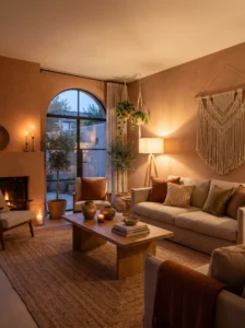
8. Earthy Terracotta Makes the Room Feel Warm
Terracotta instantly adds warmth and personality. It works because earthy tones feel grounded and inviting rather than flashy.
This color is perfect for bohemian, Mediterranean, or rustic-inspired living rooms. It pairs naturally with wood, woven textures, linen fabrics, and indoor plants.
Instead of painting every wall dark terracotta, many homeowners use softer clay-inspired shades for a more livable look. Accent walls also work beautifully.
Avoid combining terracotta with cool gray furniture because the undertones clash. Warm neutrals and natural textures work much better.
A terracotta living room feels especially cozy in the evening under warm lighting, creating a welcoming atmosphere for guests and family alike.
9. Olive Green Feels Rich and Cozy
Olive green creates a moodier, richer atmosphere compared to sage. It brings depth while still feeling connected to nature.
This color works beautifully in larger living rooms, especially those with leather furniture, dark wood, or vintage decor. It looks stunning with brass and black accents.
Olive green works best when layered with warm lighting. Cool white bulbs can make it appear dull or muddy.
Use lighter curtains and rugs to keep the room balanced. Too many dark elements may make the space feel enclosed.
In real life, olive green creates a cozy “library” feeling that encourages relaxing evenings and conversation.
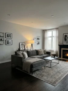
10. Charcoal Gray Creates Modern Drama
Charcoal gray is bold but incredibly stylish when done right. It creates contrast and sophistication that lighter neutrals cannot match.
This shade works best in spacious living rooms or rooms with abundant natural light. Pair it with white trim, warm wood, and soft textiles to avoid a cold appearance.
One smart approach is using charcoal on one feature wall instead of the entire room. It adds depth without making the space feel smaller.
Charcoal walls also make artwork and lighting stand out beautifully. It creates a gallery-like effect that feels high-end.
For daily living, darker walls can surprisingly feel cozy and relaxing, especially during evenings.
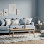
11. Dusty Blue Feels Soft and Airy
Dusty blue offers color without overwhelming the room. It feels peaceful, slightly coastal, and easy to live with.
This shade works well in smaller living rooms, apartments, or homes with lots of sunlight. Pair it with white trim, beige furniture, and soft textures.
Avoid overly bright blues unless you want a playful space. Dusty muted blues feel more sophisticated and timeless.
One advantage of dusty blue is versatility. It works in modern, farmhouse, coastal, and traditional homes.
The room often feels cooler and calmer, which many people appreciate in warmer climates.
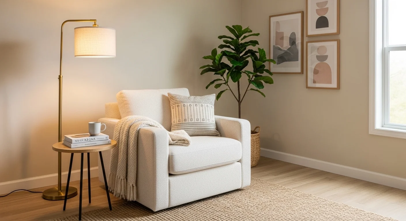
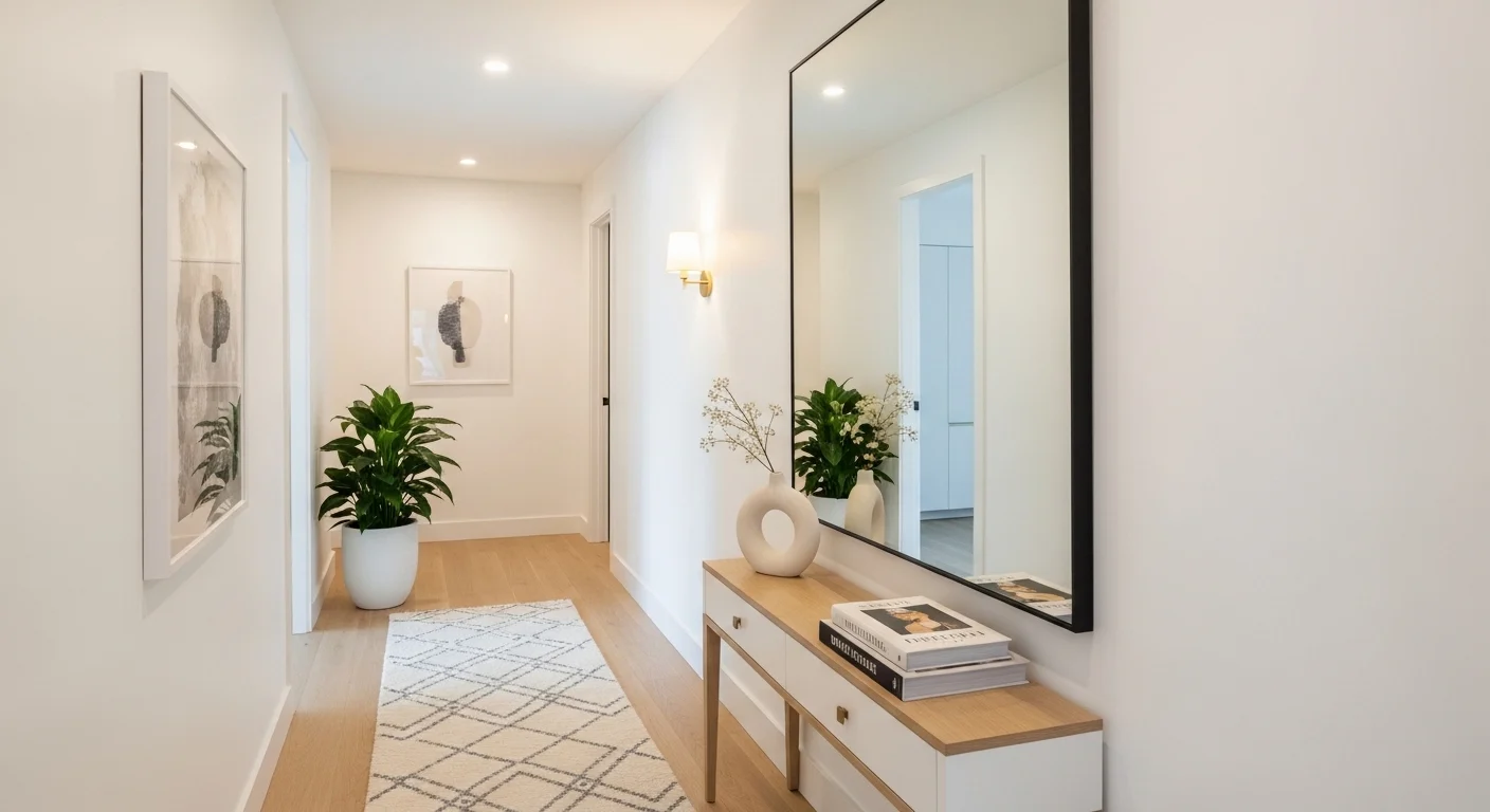
12. Cream Paint Feels Warmer Than White
Cream is often overlooked, but it creates a softer and more comfortable atmosphere than stark white walls.
This shade is excellent for traditional homes, cozy family spaces, and living rooms with warm wood flooring. It works especially well with layered neutral decor.
The key is choosing a cream that does not lean too yellow. Subtle warm undertones feel elegant, while overly yellow creams can feel outdated.
Cream walls create a welcoming backdrop that works well year-round. The room feels warm even during cloudy weather or nighttime lighting.
13. Deep Forest Green Creates Luxury
Forest green feels bold, luxurious, and surprisingly timeless. It works best when you want the living room to feel intimate and stylish.
This shade pairs beautifully with velvet furniture, gold accents, dark wood, and warm lighting.
Use it in rooms with decent ceiling height and enough natural light. Smaller dark rooms may feel overly enclosed with this color.
One practical tip is balancing dark walls with lighter ceilings and rugs. That prevents the room from feeling too heavy.
Forest green living rooms often feel elegant without looking overly formal.
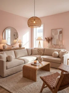
14. Pale Pink Can Actually Look Sophisticated
Soft muted pinks are not just for bedrooms. In the right shade, pale pink acts almost like a neutral.
This color works beautifully in living rooms with warm lighting, beige furniture, and natural textures. It creates warmth without obvious color saturation.
The key is choosing dusty or blush-inspired tones instead of bright pink. Muted shades feel mature and calming.
Pale pink reflects warm light beautifully, making the room feel softer during evenings.
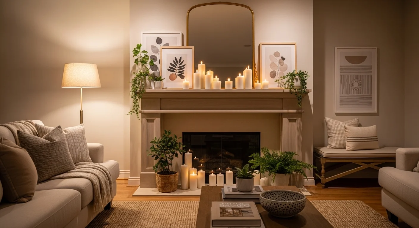
15. Dark Brown Creates a Cozy Lounge Feel
Dark brown walls are making a quiet comeback because they create warmth and intimacy. They feel grounded and comforting.
This color works best in larger living rooms with strong lighting and layered textures. Pair it with cream furniture, warm metals, and natural wood.
Avoid using flat dark brown paint without texture or contrast. Adding layered lighting is essential.
A dark brown living room often feels more relaxing at night compared to bright white spaces. It creates a cozy atmosphere similar to boutique hotels or upscale lounges.
Comparison Table
| Type | Best Use | Material Pairing | Style/Vibe | Difficulty Level |
|---|---|---|---|---|
| Warm White | Small bright rooms | Wood, linen, cotton | Clean & cozy | Easy |
| Greige | Open-concept homes | Mixed textures | Modern balanced | Easy |
| Sage Green | Relaxed family rooms | Oak, brass, woven decor | Calm & natural | Medium |
| Navy Blue | Accent walls | Leather, gold accents | Dramatic & elegant | Medium |
| Charcoal Gray | Large modern spaces | Metal, wood, marble | Bold contemporary | Hard |
| Terracotta | Warm earthy interiors | Rattan, clay, wood | Rustic & cozy | Medium |
Buying Guide / How to Choose the Right Living Room Paint Color
Choosing a living room color is not only about liking a paint swatch. The size of the room, the amount of natural light, furniture colors, and even your daily lifestyle matter more than most people realize.
Start with room size and lighting. Small living rooms usually benefit from lighter shades because they reflect light and create openness. Dark colors can work in small rooms too, but only when balanced with mirrors, lighting, and lighter furniture. Large rooms often handle darker shades more comfortably because the space already feels open.
Material choices inside the room should guide your paint decision. Warm wood floors usually pair better with warm paint undertones, while cooler gray flooring often suits cooler neutrals. Leather sofas, brass lighting, and natural fabrics also affect how paint appears in real life.
Durability matters more in living rooms than people expect. Matte paint looks elegant, but it can show marks more easily in high-traffic homes. Eggshell or satin finishes are usually easier to clean without looking overly shiny.
Budget is another practical factor. Premium paints often cover better and require fewer coats, which sometimes saves money overall. Cheap paint may look inexpensive after a year due to fading or uneven wear.
One of the biggest mistakes people make is testing paint in only one lighting condition. A color that looks perfect at noon may look completely different at night under warm bulbs. Always test samples on multiple walls and observe them throughout the day.
Another common mistake is copying social media trends without considering personal lifestyle. A dramatic black living room may look stunning online but feel exhausting in a small apartment with limited sunlight. The best paint color is the one that supports how you actually live every day.
Conclusion
Choosing the right living room paint color is less about following trends and more about understanding how a space should feel. The best living rooms are not always the boldest or most expensive-looking ones — they are the rooms people genuinely enjoy spending time in.
Warm whites, soft beiges, and greige tones remain popular because they are flexible and easy to live with. On the other hand, deeper shades like navy, forest green, and charcoal can create incredible atmosphere when used thoughtfully. There is no single “perfect” color for every home because lighting, furniture, layout, and personal taste all change the outcome.
The smartest approach is to think beyond the paint sample itself. Consider how the room looks in the morning, how it feels at night, and how it supports your everyday routine. A color that makes the room feel comfortable, balanced, and welcoming will always age better than a trend chosen only for appearance.
Take your time testing shades, compare undertones carefully, and trust the atmosphere the room creates rather than chasing perfection. Most people do not regret choosing a practical color that feels good to live with every day.
FAQs
1. What is the best color for a small living room?
Light shades like warm white, cream, or soft beige usually work best because they reflect light and make the room feel larger. However, darker colors can also work if balanced with mirrors and good lighting.
2. Should living room paint be warm or cool?
It depends on the lighting and furniture. Warm tones feel cozy and inviting, while cool tones feel cleaner and more modern. Most homes benefit from slightly warm undertones because they feel more comfortable.
3. What paint finish works best in a living room?
Eggshell and satin finishes are usually the best balance between appearance and durability. They are easier to clean than flat paint while still looking soft.
4. Are dark living room colors still in style?
Yes, especially shades like navy, charcoal, and forest green. Dark colors create depth and coziness when paired with lighter furniture and proper lighting.
5. How do I test paint colors properly?
Paint large sample areas on multiple walls and observe them throughout the day. Natural light and artificial light can dramatically change how a color looks.
6. What colors make a living room feel cozy?
Warm neutrals, earthy greens, terracotta, taupe, and deep blues tend to create the coziest atmosphere because they soften the room visually.
7. Should the living room color match the rest of the house?
It does not need to match exactly, but the colors should feel connected. Similar undertones throughout the home create a smoother visual flow.
8. What is the biggest paint color mistake people make?
Choosing paint before considering lighting and furniture is one of the biggest mistakes. Many colors look completely different once applied to full walls.